
Ribble Motor Services was a founding stone of today’s bus industry, a territorial operator whose red and cream buses served most of Lancashire and whose cream and red coaches — some branded Standerwick — travelled widely on express services and extended tours.
It came into existence in 1919, based in Preston and took its name from the river that flows through the city on a 75mile course from North Yorkshire to Lytham. For almost 50 years it was part of the BET group, passing into state ownership in 1967 ahead of the creation of the National Bus Company in January 1969. When NBC went corporate three years later, Ribble’s buses became poppy red and white. It was split up in 1986, losing territory to neighbouring Cumberland and the new North Western Road Car. Privatisation came late in a March 1988 management buyout that sold out to Stagecoach the following year. Stagecoach offloaded the east Lancashire operations to Blazefield in 2001 and eventually dropped the Ribble name.
Time, then, for us to imagine that Ribble is still alive but seeking a modern identity.
With Ribble’s impressive history at hand, we had lots of inspiration to draw on when it came to repositioning this iconic brand.
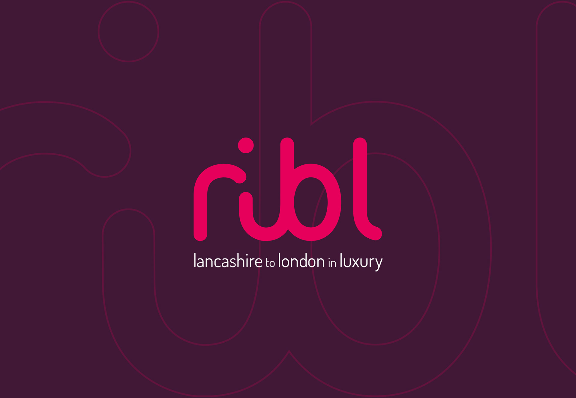
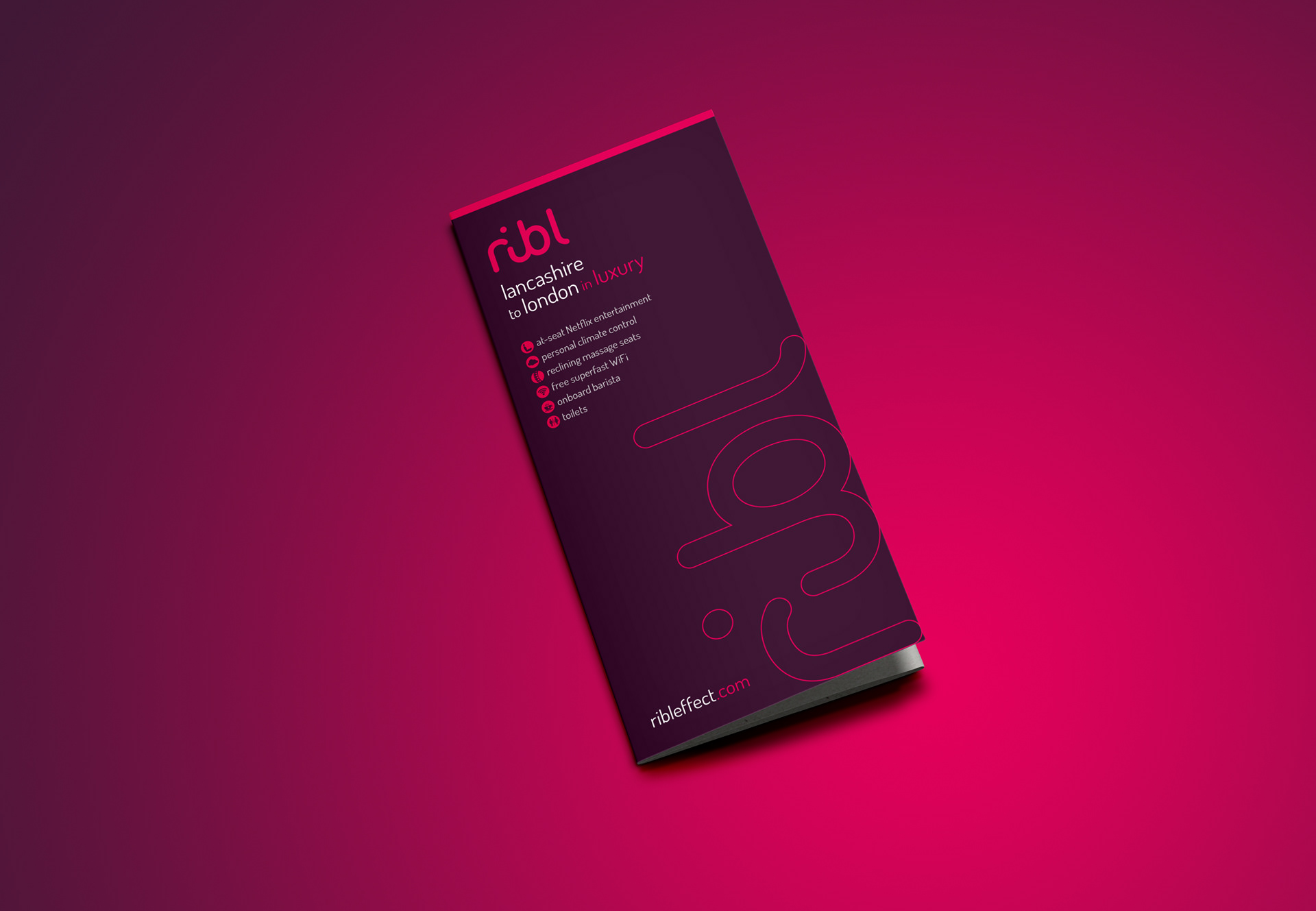
We made the decision to look primarily at its Lancashire to London coach service, affectionately called The Gay Hostess. With an eye-catching livery back in the 1960s, and offering real luxury, we were determined to do branding justice to this updated execution.
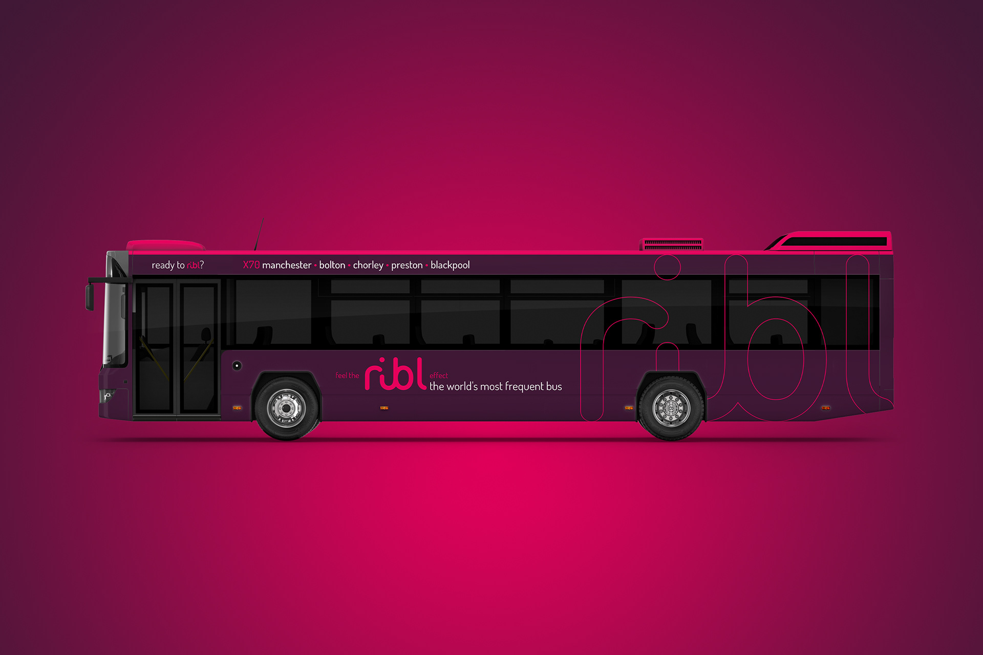
To bring a modern twist on a traditional name, we decided to drop two of the last three letters from Ribble, leaving simply Ribl. Then by having an initial lower case letter “r” we had a memorable, quirky, attractive word shape. Rather than basing the logo on a particular font, it was hand drawn by exploring the way the letters worked together. By removing any corners, the logo has a softness and flow to it, yet maintains that all-important legibility.
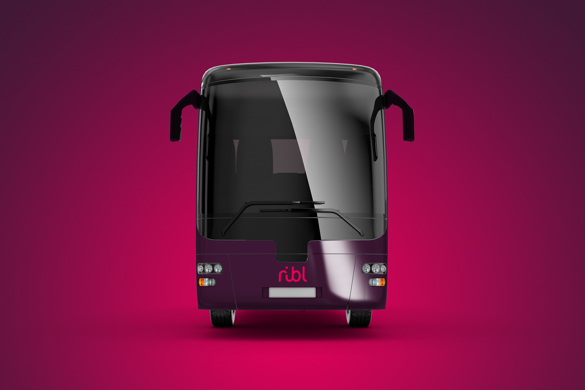
Unsurprisingly, we have ditched the 1960s colour palette and gone for a contemporary deep plum base colour that exudes luxury and class. It is coupled with a secondary hot pink that gives the livery some real pizzazz. The large, yet subtle, pink identity graphic at the rear of the bus is eye catching against the dark plum, and as it is limited to a thin key line, offers minimal viewing intrusion.
The strapline ‘feel the ribl effect’ is a nod to the high standard of comfort you would enjoy travelling on this coach and offers a subtle play on words. The timetable provides an example of how the branding would evolve — simple, stylish and above all classy.
The 21st-century benefits take pride of place and have been updated to be cutting-edge today and include at-seat Netflix entertainment, personal climate control, reclining massage seats, free superfast WiFi, onboard barista and toilets.
The coach livery design translates across to the standard bus design with an air of simplicity. This one we have marked as ‘the world’s most frequent bus’, taking the lead again from the original Ribble services X60 and X70 that held the — possibly self-proclaimed — title back in the 1960s.