

You can't afford to look at things in isolation on any rebranding project - be it a timetable, livery or website - as all the elements have to be interchangeable, adaptable and complimentary.
Branding confidence in your product is something that is often preached yet rarely practised in the commercial world, and transport brands are not alone in thinking if there is space, it should be filled. However, seeing something advertised with the simplicity of a product shot and a few words of text makes the observer believe the brand knows what it's doing. It's in the human psyche to then think they're not like everybody else.
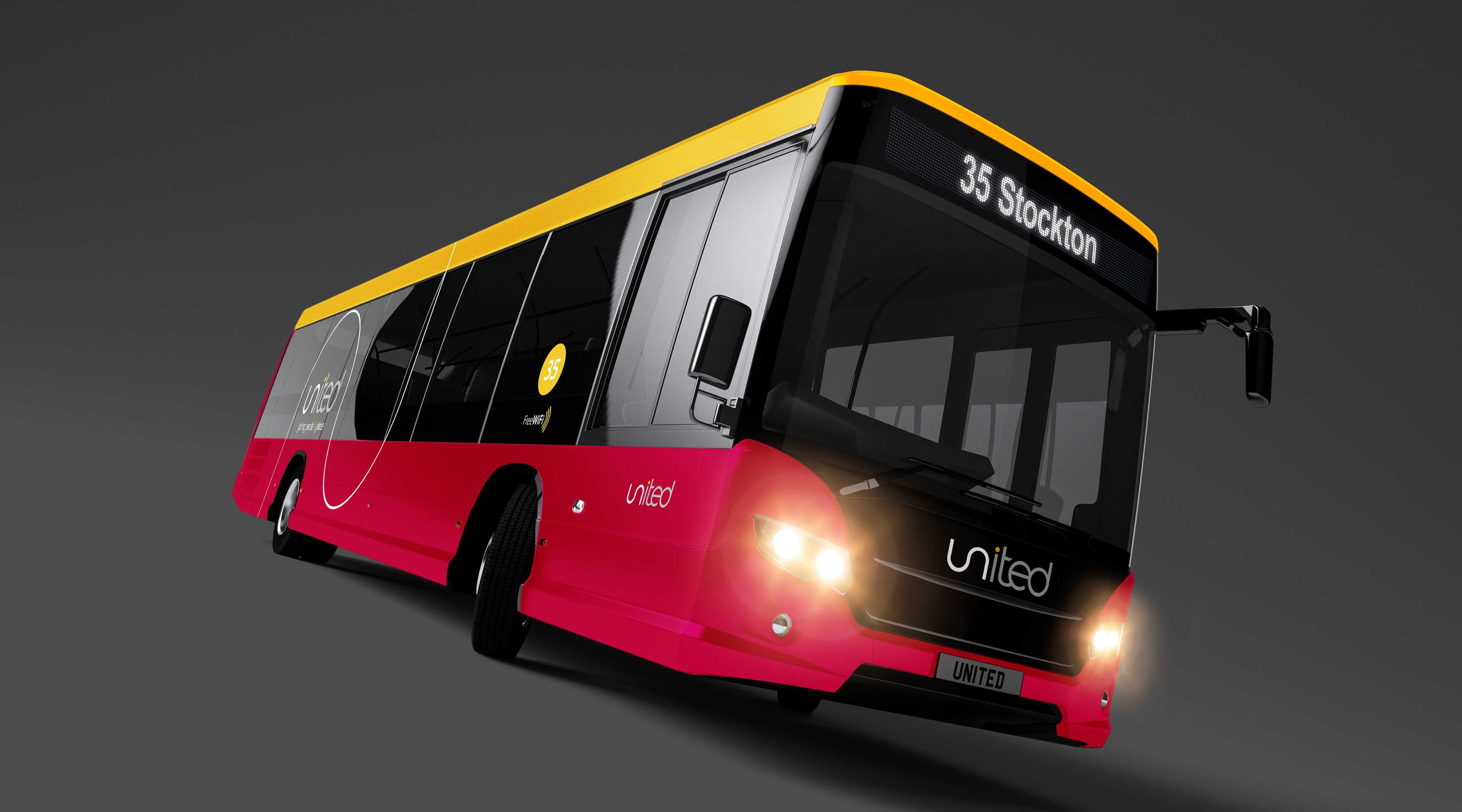
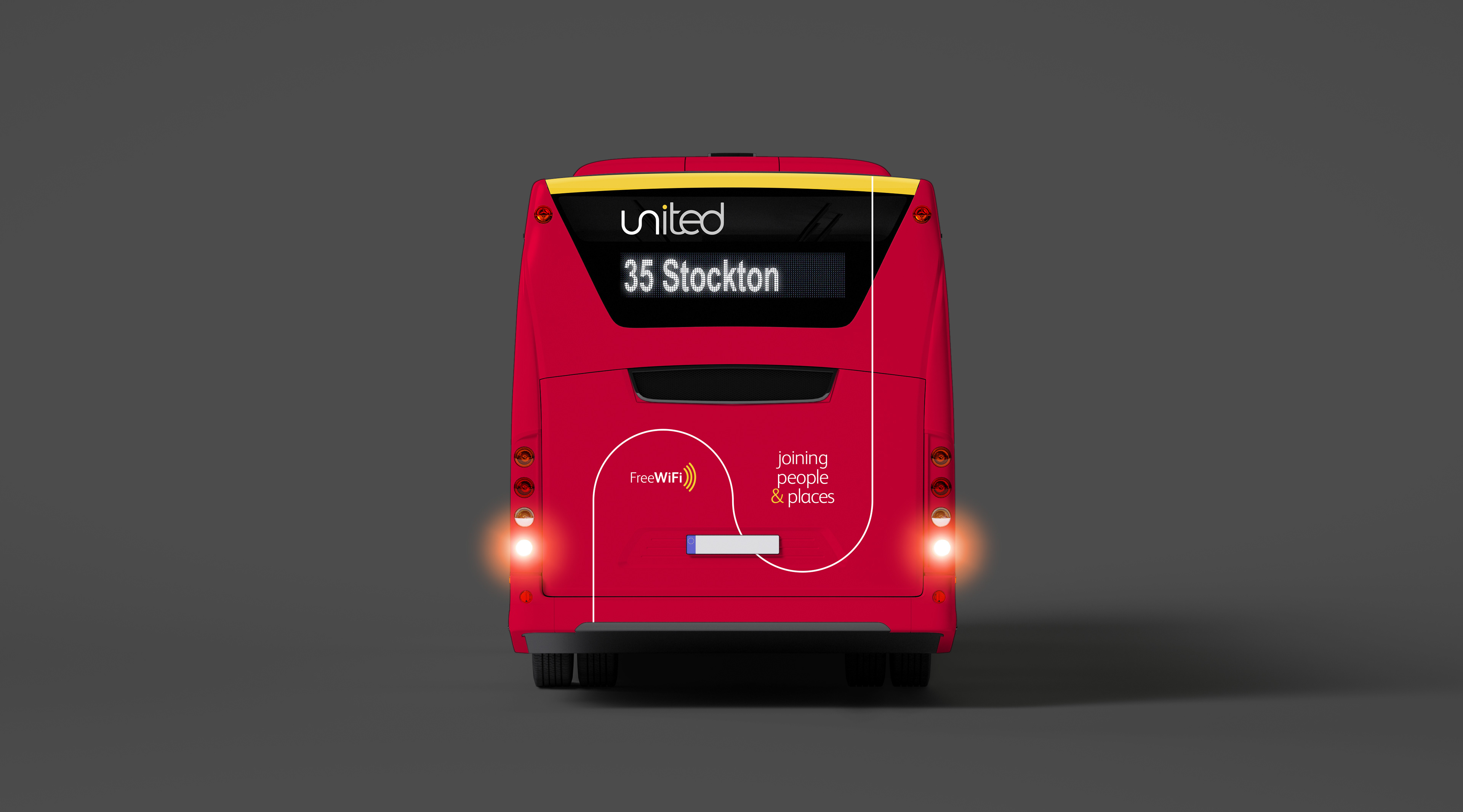
This approach was the inspiration for the rebrand of United Buses - nothing is elaborate, nothing is over-designed, nothing is done ' because we can'. Everything was done to make a suite of branding material stand out on the streets of the northeast and stick in the minds of its customers.
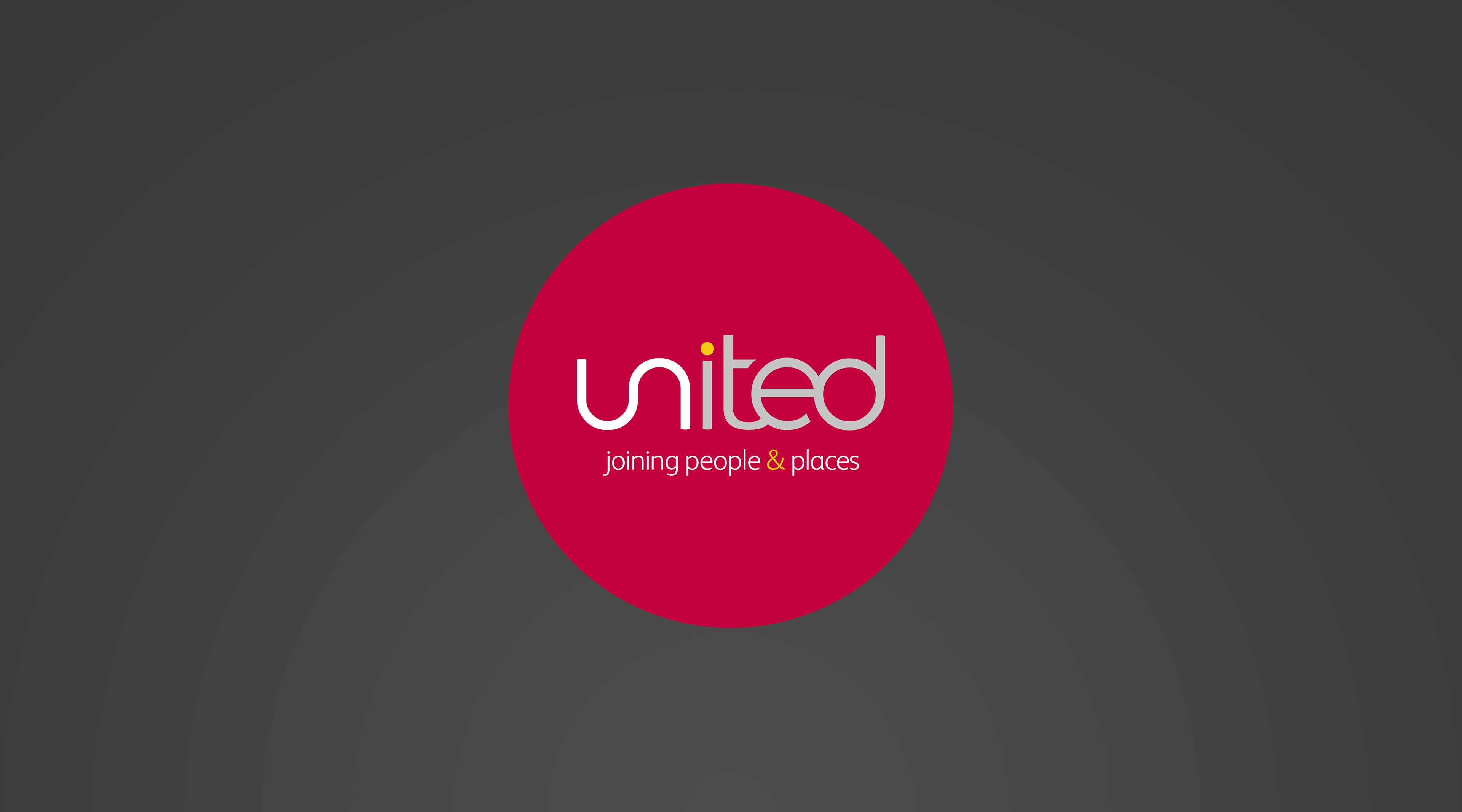
The real key to this rebrand was the styling of the U and N at the start of the company name. Joining them together allowed us to create not only a recognisable icon for the livery but also a shape that could be lengthened or shortened according to requirement. The timetable is an excellent example of its adaptability.
Little touches like the route number colour matching the dot on the 'i', which in turn matches the colour of the top yellow strip tie the simplicity of this rebrand together nicely.
United is now a brand confident in what it delivers and summed up in the strapline 'united - joining people & places'.