Cleveland Transit was a bus company that, in terms of livery, was about as traditional as you could get. At one stage, it was a combination of green and cream as far as the eye could see - truly representative of the era and instantly recognisable on the streets of the north-east.
As we're never an agency to sit on the fence, we set about trying to achieve the same branding awareness on the streets of the 21st century.
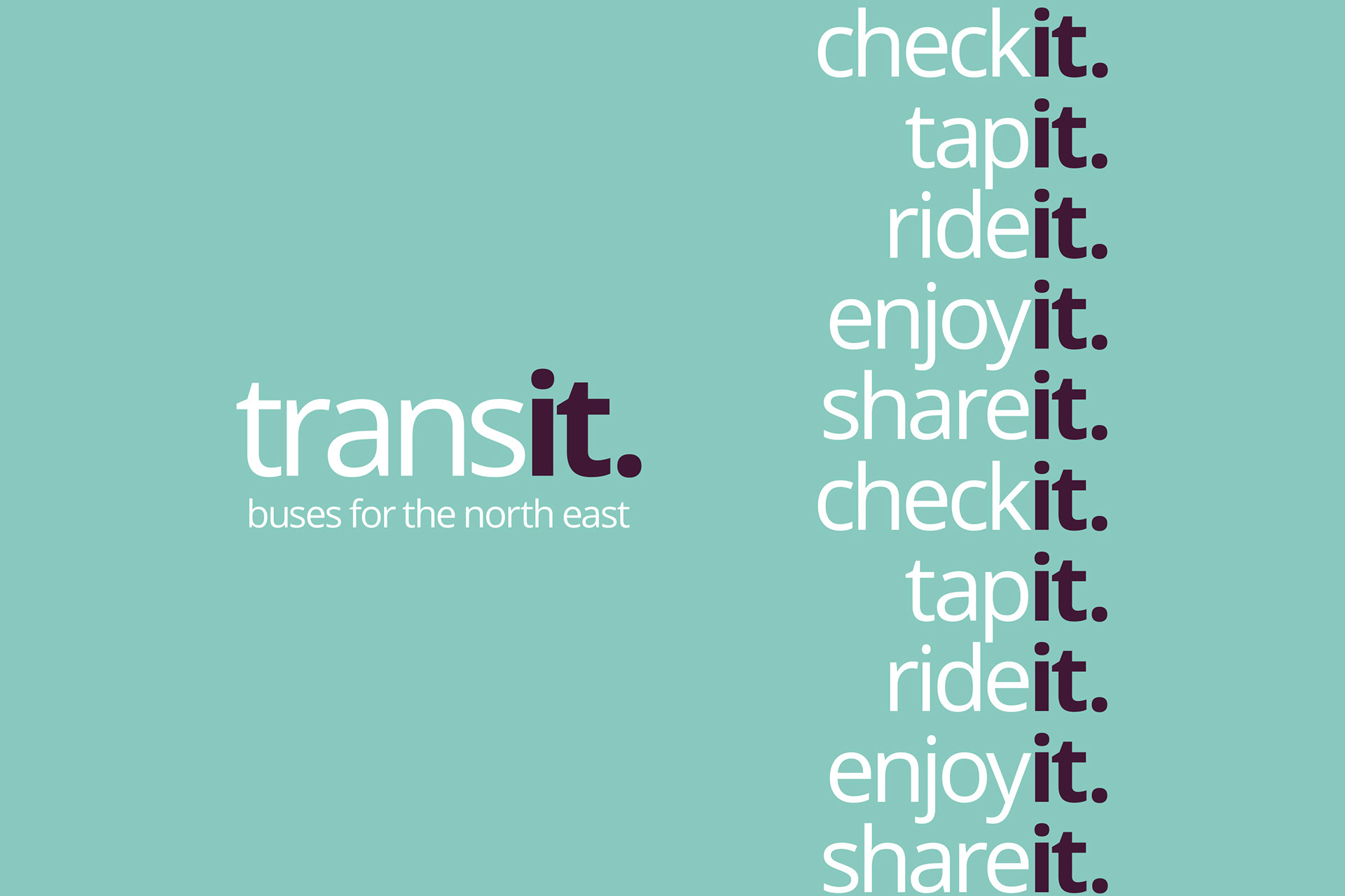
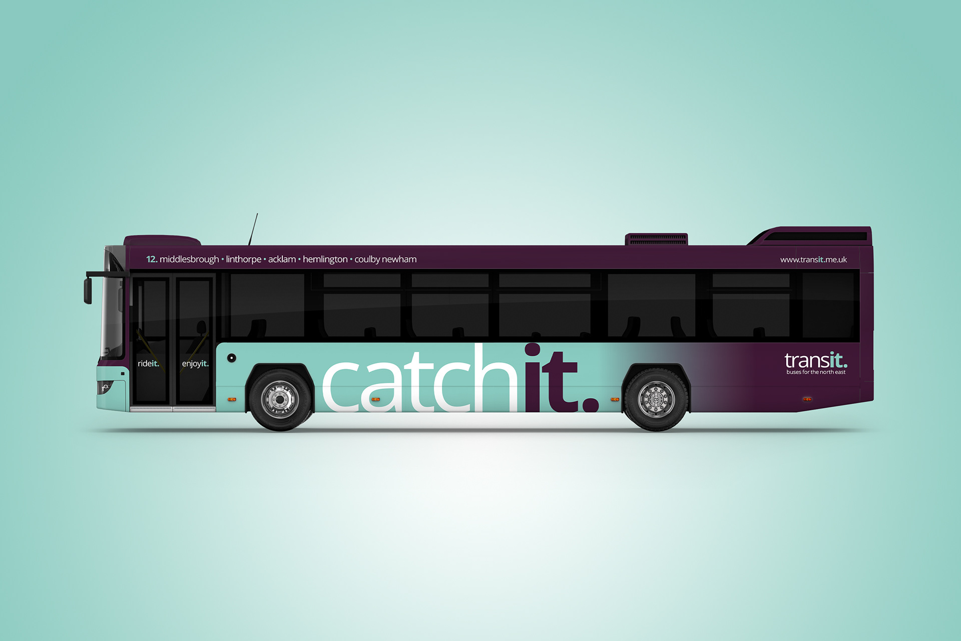
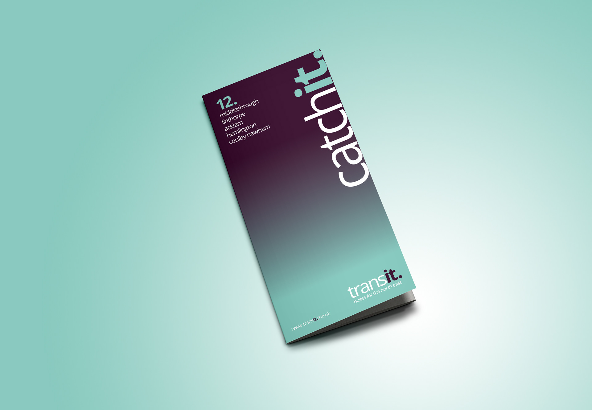
Although the name Cleveland Transit is perfectly acceptable in covering both the geography and type of service, it was deemed a little wordy and lacking a bit of snap. A quick edit, leaving just the word 'Transit' not only solved that problem but its execution opened several strapline/positioning opportunities.
This new name asked the customer to catch it, ride it and enjoy it - the extension of these possibilities is exhaustive and forms the basis of some great, easily remembered marketing.
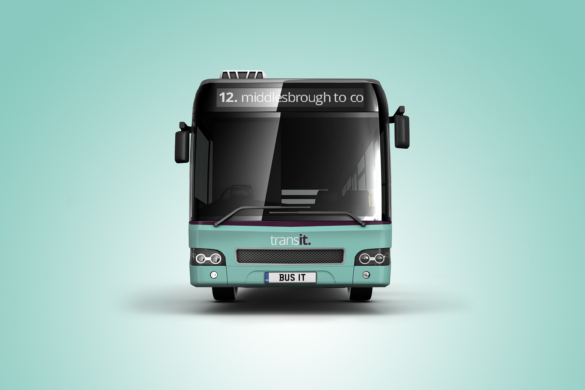
Colour-wise a shift to a more minty green was felt more appropriate, offset and graduated with a rich purple. A dynamic change from its heritage but one that would be distinctly different to anything else on the streets of Middlesbrough and surrounding areas.
To mix things up a touch we decided to run a 'catch it' message in between the wheel arches, as opposed to the company name. Sitting the lettering below the skirt line is certainly not commercially acceptable, but when you're working on a concept, anything goes!
The combination of name, colour and strapline across the whole marketing suite would ensure that this brand could talk the talk as well as walk the walk.