


When a bus operator has the word “Red” in its original title, the odds on its core livery being anything other than that colour (even in a rebrand) are fairly slim.
Some brands are synonymous with a colour — Cadburys purple, Ferrari red, easyJet orange – and this particular company falls squarely into that category.
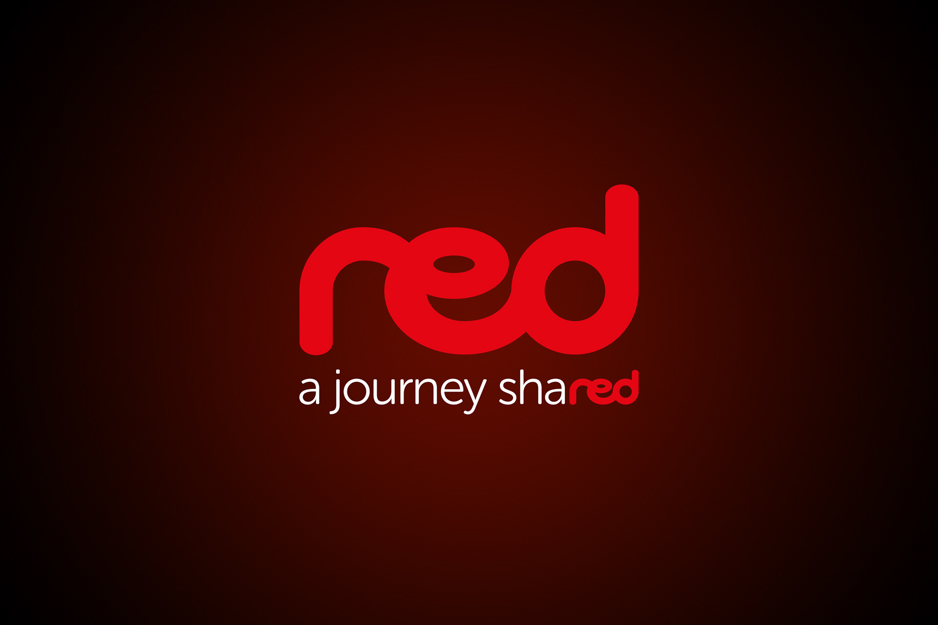
To complement this decision on colour, the existing name “Midland Red” has become a shorter, snappier and more modern “red” with the new, improved identity following suit.
Created using a bespoke, hand-drawn logo, the lower case wording is easy on the eye and has a flow that represents the ease of travelling with this particular operator.’
The main area of the livery makes use of a bright to dark red gradient. This contrast in colour, and the oversized use of the curved bespoke logo, means it’s guaranteed to stand out on the roads without the need for additional colours.
The message “always honoured to have you on board” above the doors shows an appreciation for the waiting passengers and the strapline “a journey shared is a journey improved” summarises what this new brand is all about for the people who use it.
Note the subtle use of the “red” lettering at the end of both honoured and shared to offer even more branding consistency.
The timetable cover provides a perfect synergy with the livery, leaving the passenger in no doubt which operator’s services it is marketing. Simple, striking and most importantly informative, the cover would stand out on any display rack in the city.
The brand has evolved to become one that is proud to represent Worcester and one that is most definitely proud to be red.