Mainline was the name that South Yorkshire Transport adopted a few years after deregulation to set the arms-length company firmly apart from its past as the bus operating wing of South Yorkshire PTE.
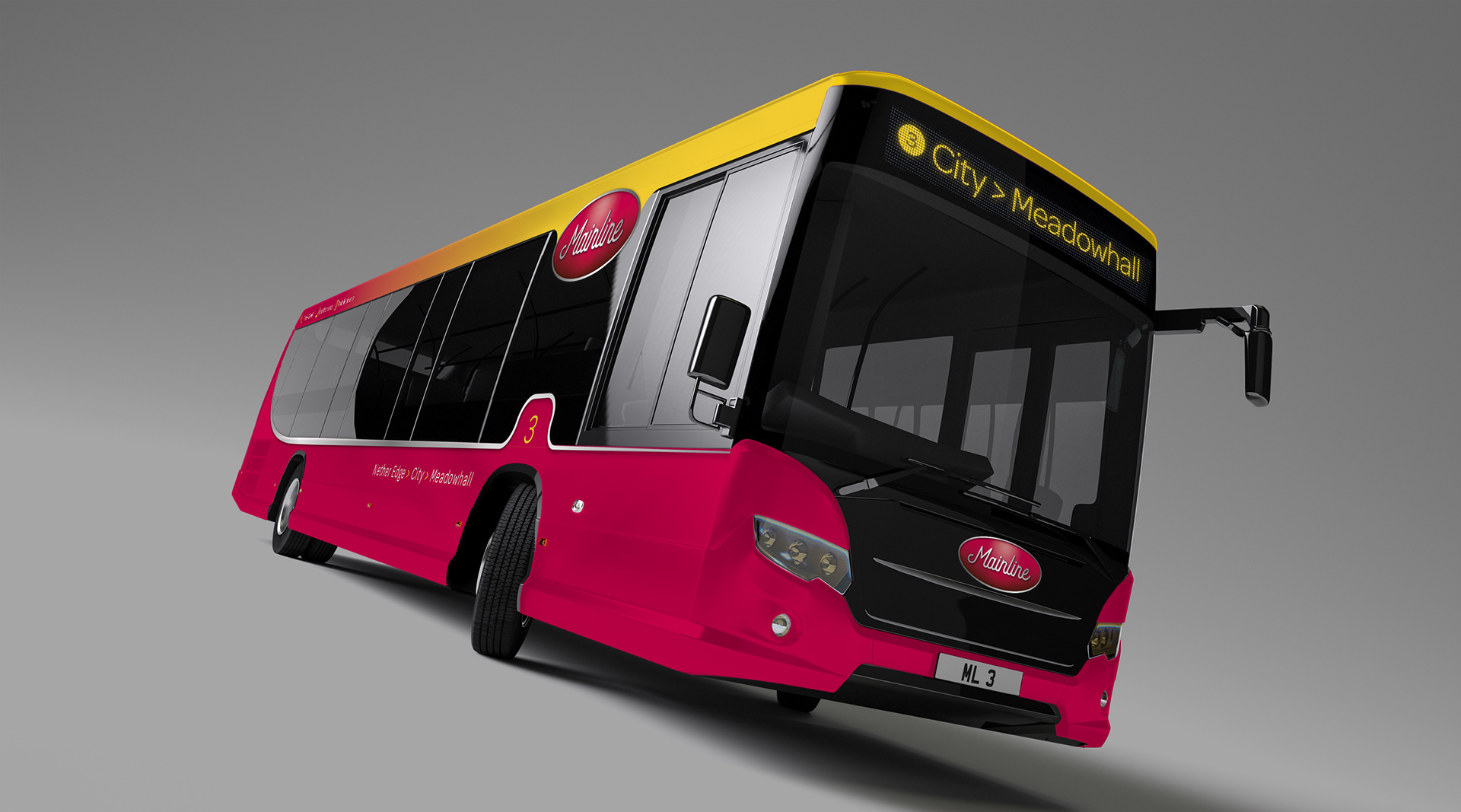
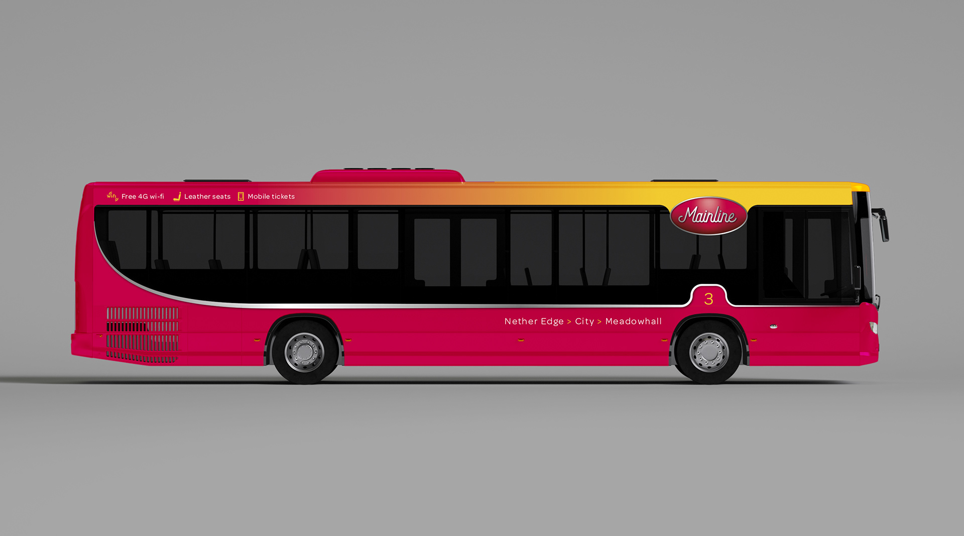
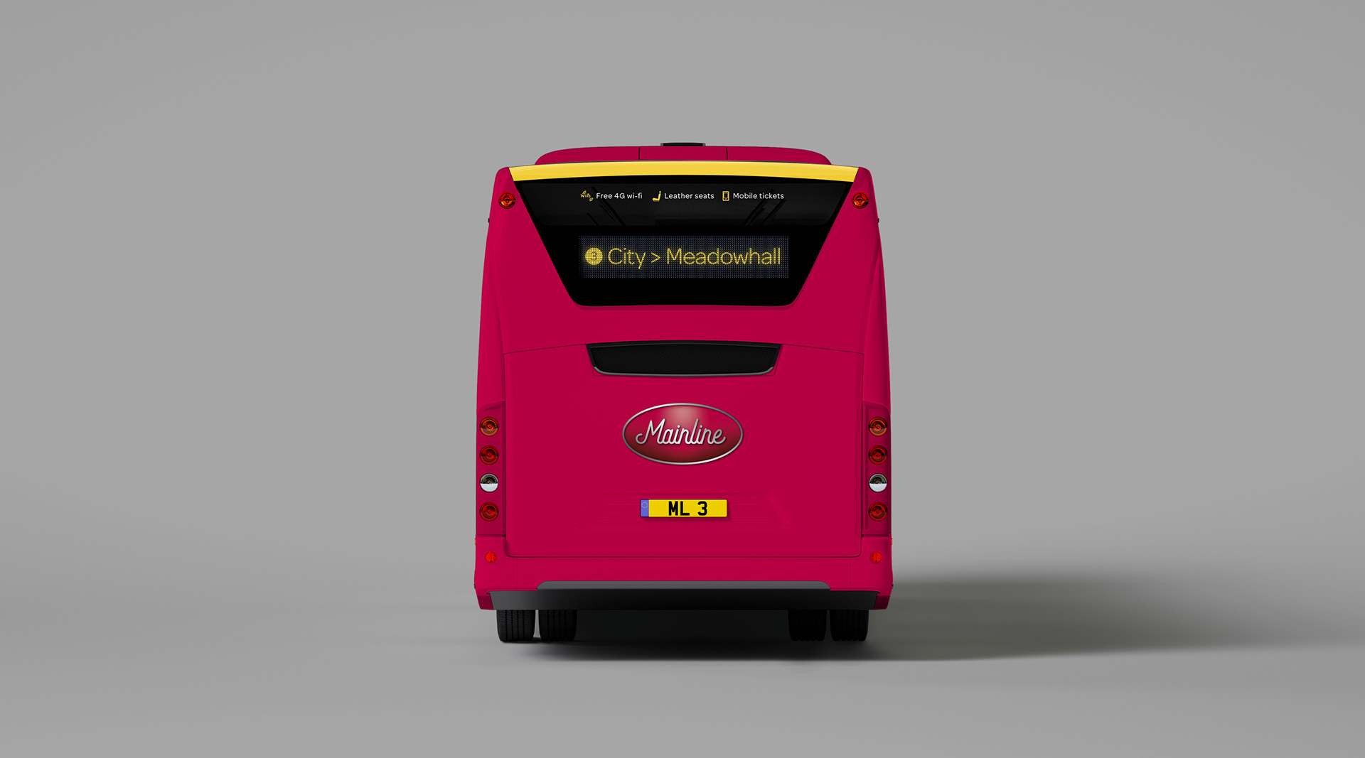
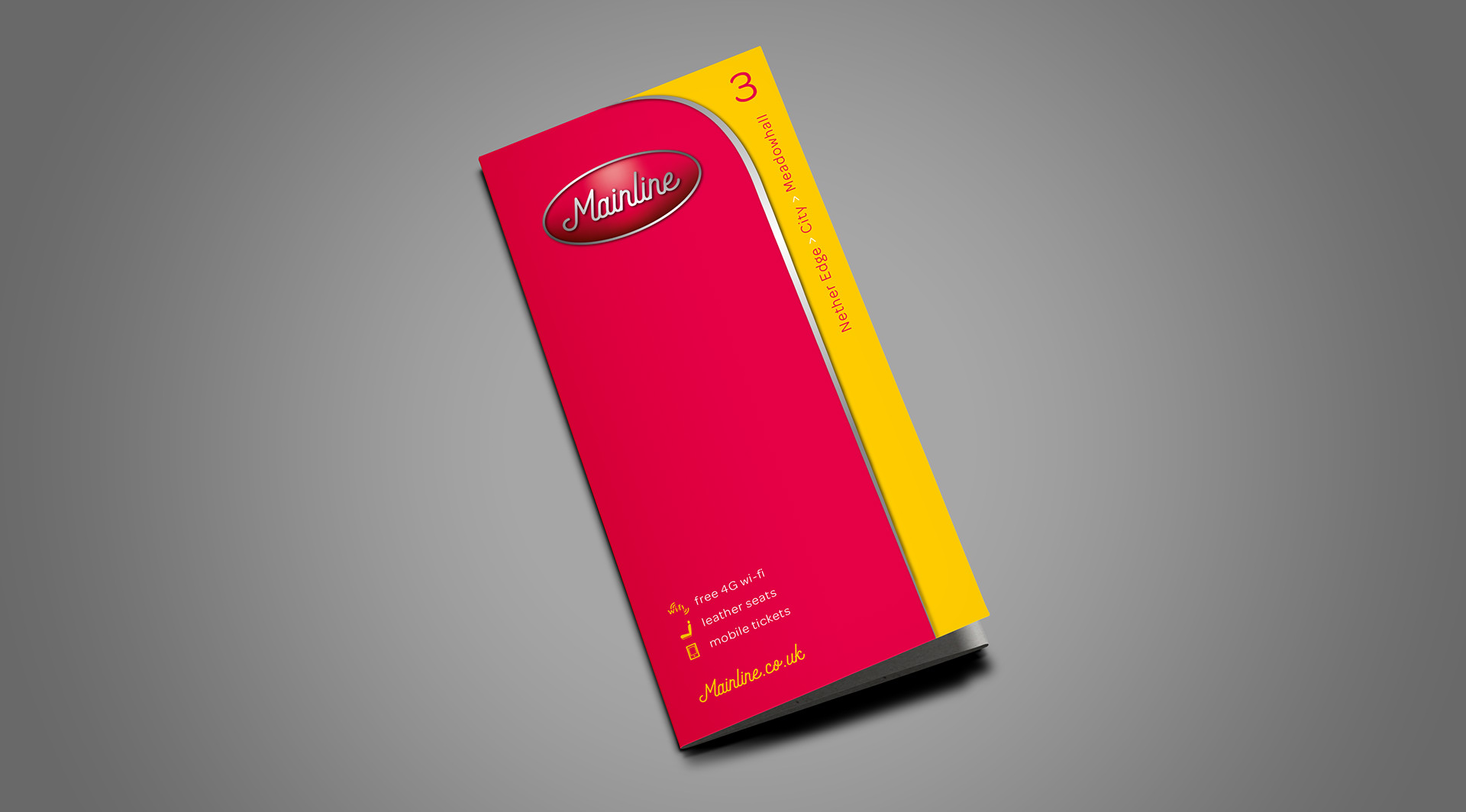
From 1992, when the Mainline identity was applied across the fleet, the livery became red and yellow with bands of grey and dark blue.
However, the writing was on the wall for its separate identity after First bought the employees’ 80% in May 1998 and began applying its corporate ‘Barbie’ liveries. Today it is First South Yorkshire.
For this project, we imagined that those corporate takeovers did not happen and that Mainline is still around today by creating a 21st-century identity for this child of the late 1980s...
This new branding is definitely a case of evolution rather than revolution. The colour palette was left largely untouched. The only significant change to this element of the branding was to switch the emphasis, with yellow, fading in above the windows, playing second fiddle to a dominant red.
The reason? We believe that the yellow is stronger when used as a highlight against the red. Plus the red would hide dirt better in the lower panels!
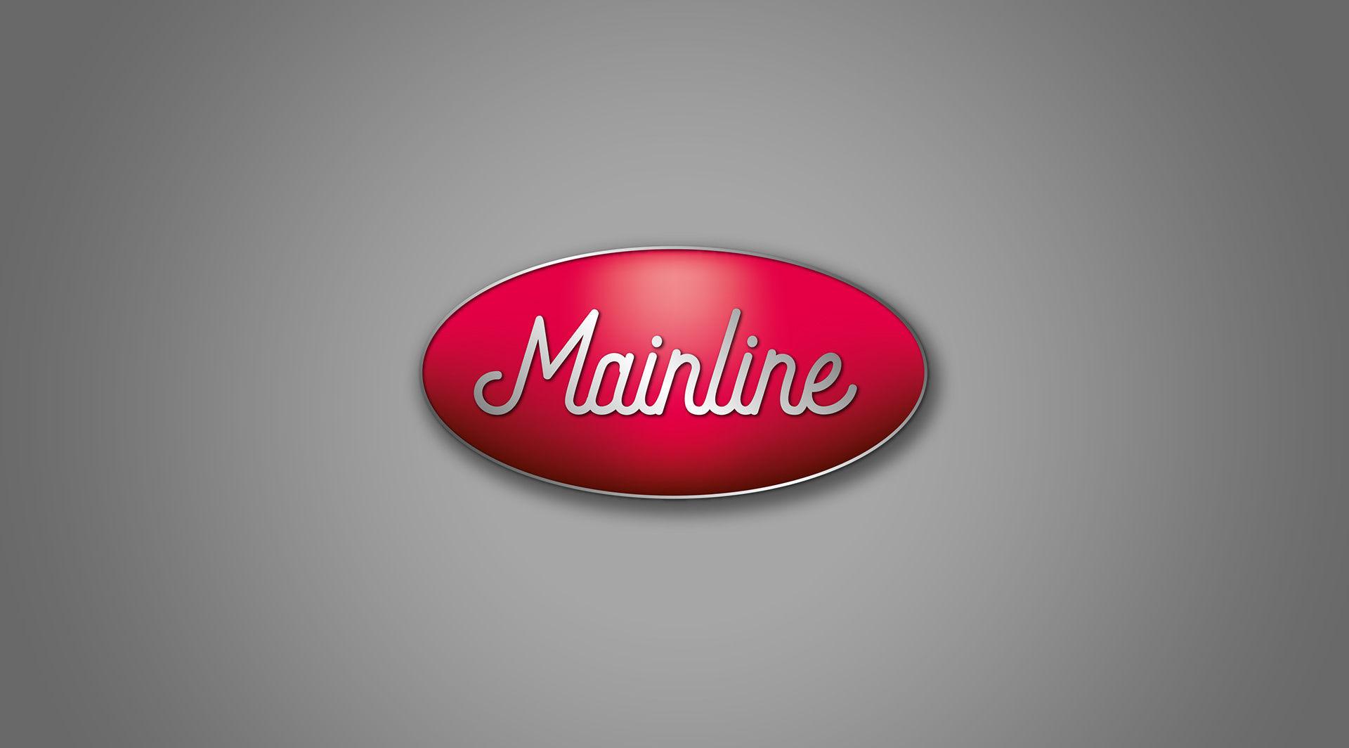
We then swapped the company’s original identity, with its sole use of upper case lettering, for title case and adopted a more scripted, fluid, joined up approach. Housed in an ellipse, our intention is to show this off with a chrome finish on the livery, matching it to the bottom of the windows. Just a little homage to the classic vehicles of years gone by.
As ever, we have carried through the lines, colours, fonts and details of the rebranding wherever the customer comes into the contact with the new, improved Mainline brand.