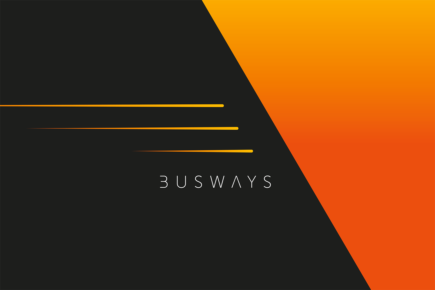
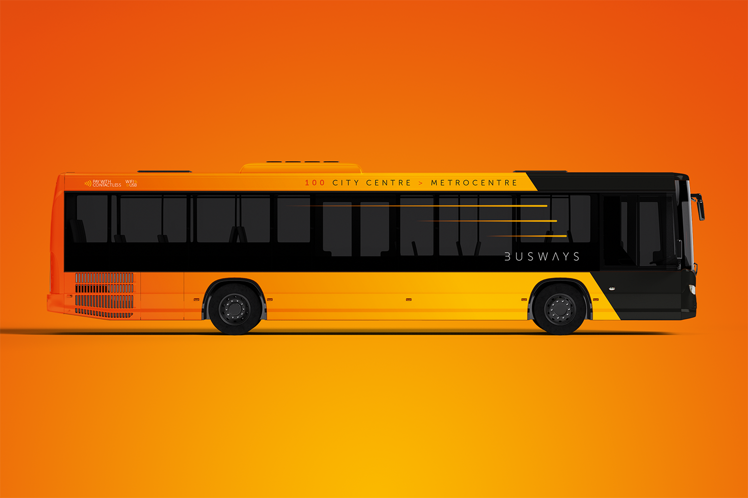
This month we imagine that Newcastle Busways is still around and craving an updated identity as it heads towards the 2020s.
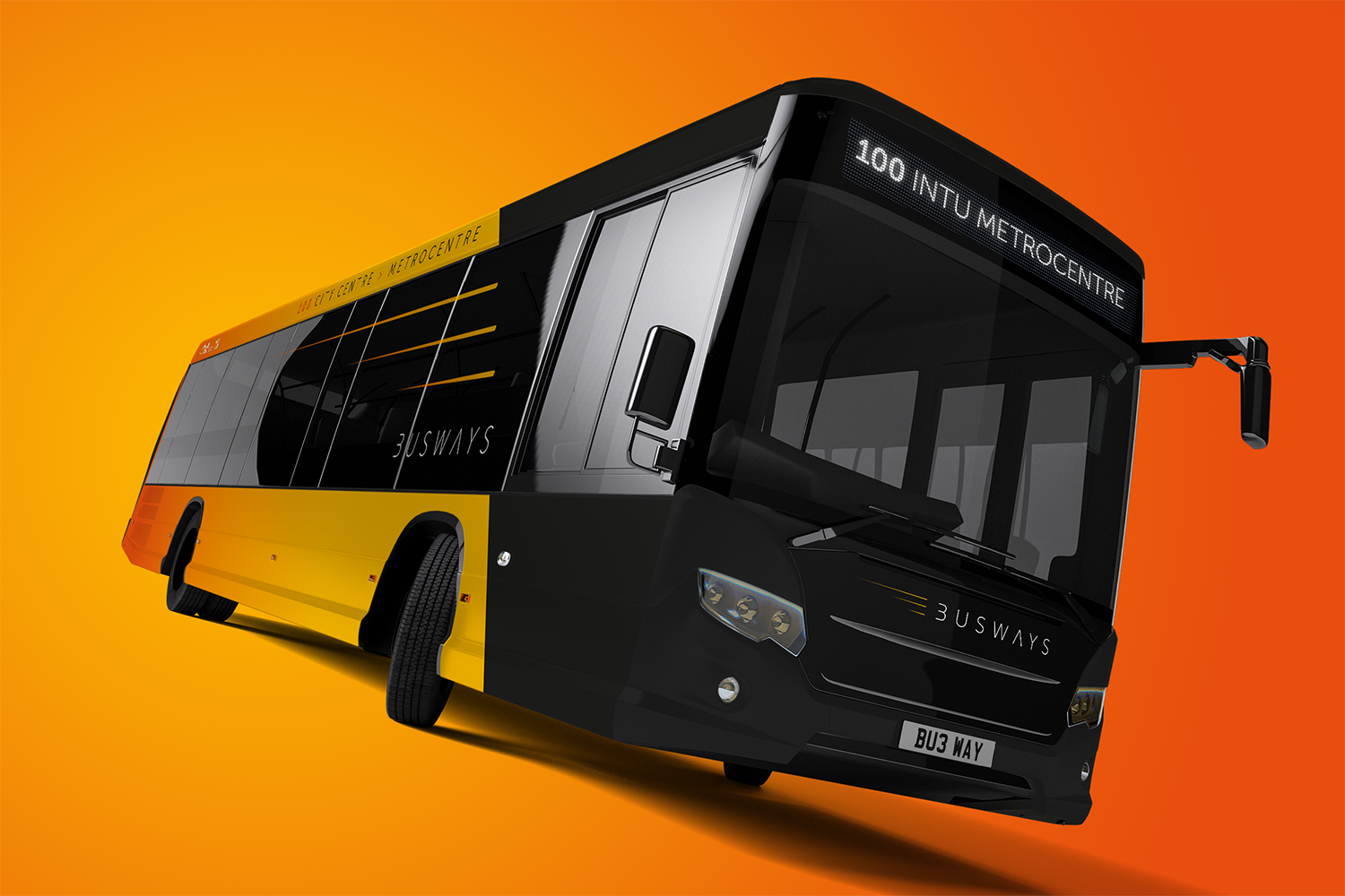
The original colour has been largely kept, although it now benefits not only from a much richer shade but also a slight graduation from the back of the vehicle to its front.
The orange works in combination with a rich black to make a real design statement.
The subtle use of splitting the two colours at a slight angle coupled with three orange “go faster” stripes set the tone for how this brand should now be perceived. Dynamic and forward thinking.
After keeping the full original name for our Stratford Blue livery last month, we revert to type this month, ditching Newcastle and the other place names for a simple, modern, more user-friendly Busways. Executed in a full upper-case font, the new identity is a world away from its predecessor.
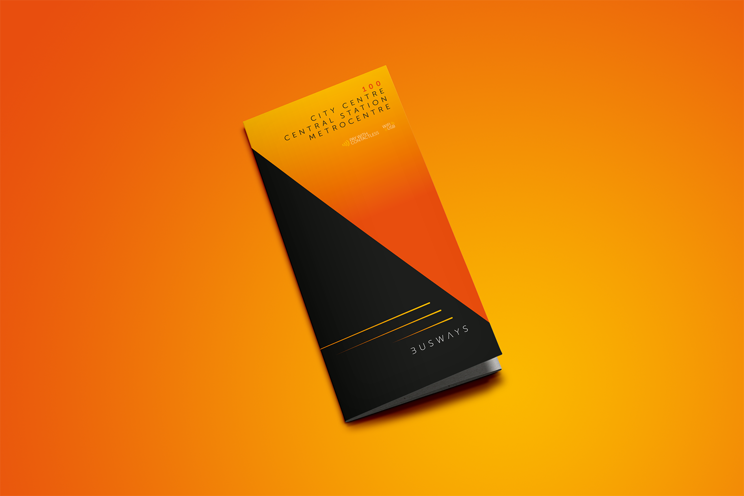
The styling and colourways used on the livery are followed through seamlessly to the timetable, so stand-out on the rack is achieved immediately.