A trip to South Wales beckons this month as we come to the branding rescue of a rather confused Merthyr Tydfil Transport.
A little research told us that previous incarnations of the company’s look showed off a succession of colour schemes – blue, orange/brown, orange/cream as well maroon — not helping the inhabitants of this South Wales industrial town a great deal.
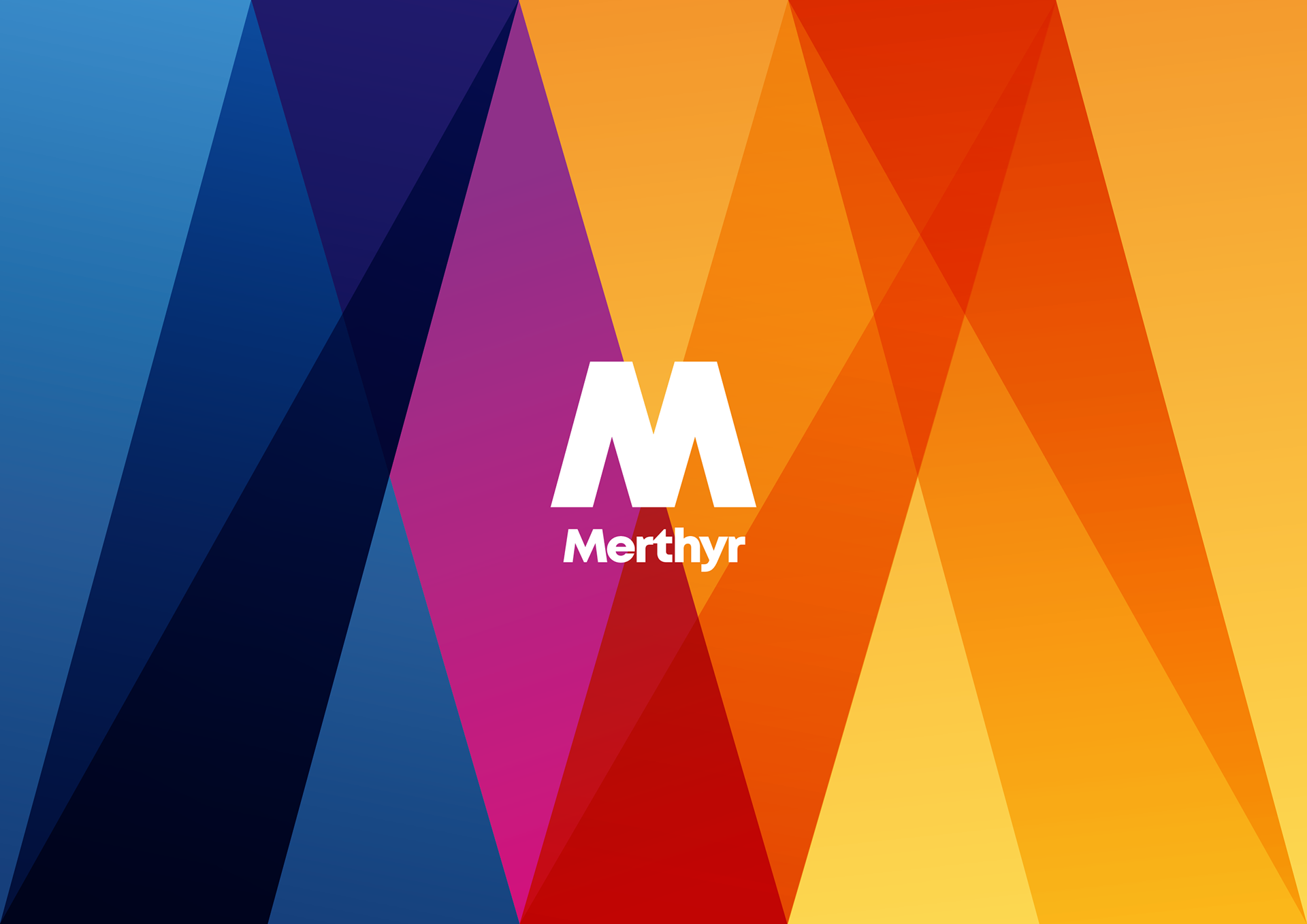
We came to the conclusion that if the past was a rainbow of different colours, the future could be too, albeit a lot more stylish and consistent.
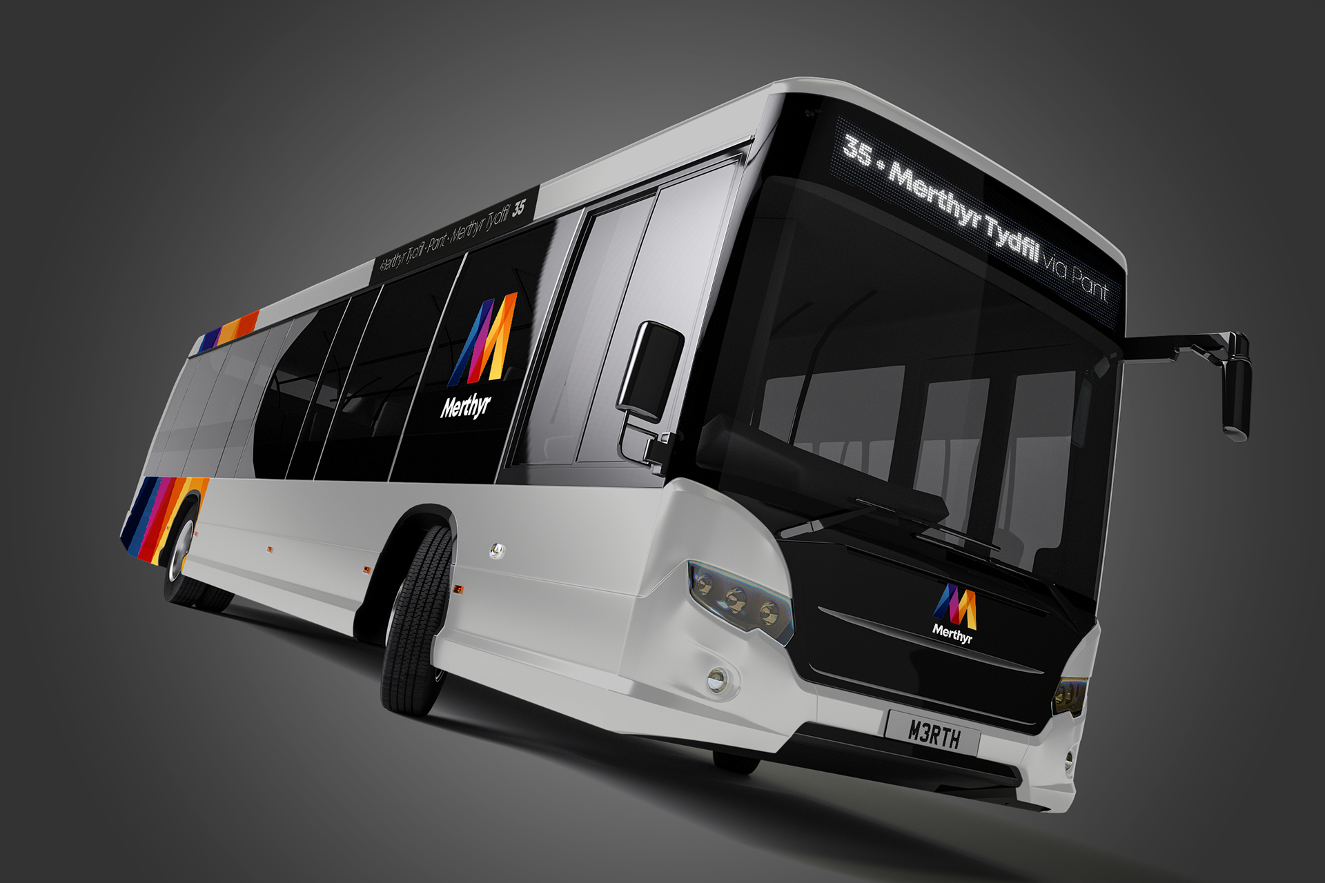
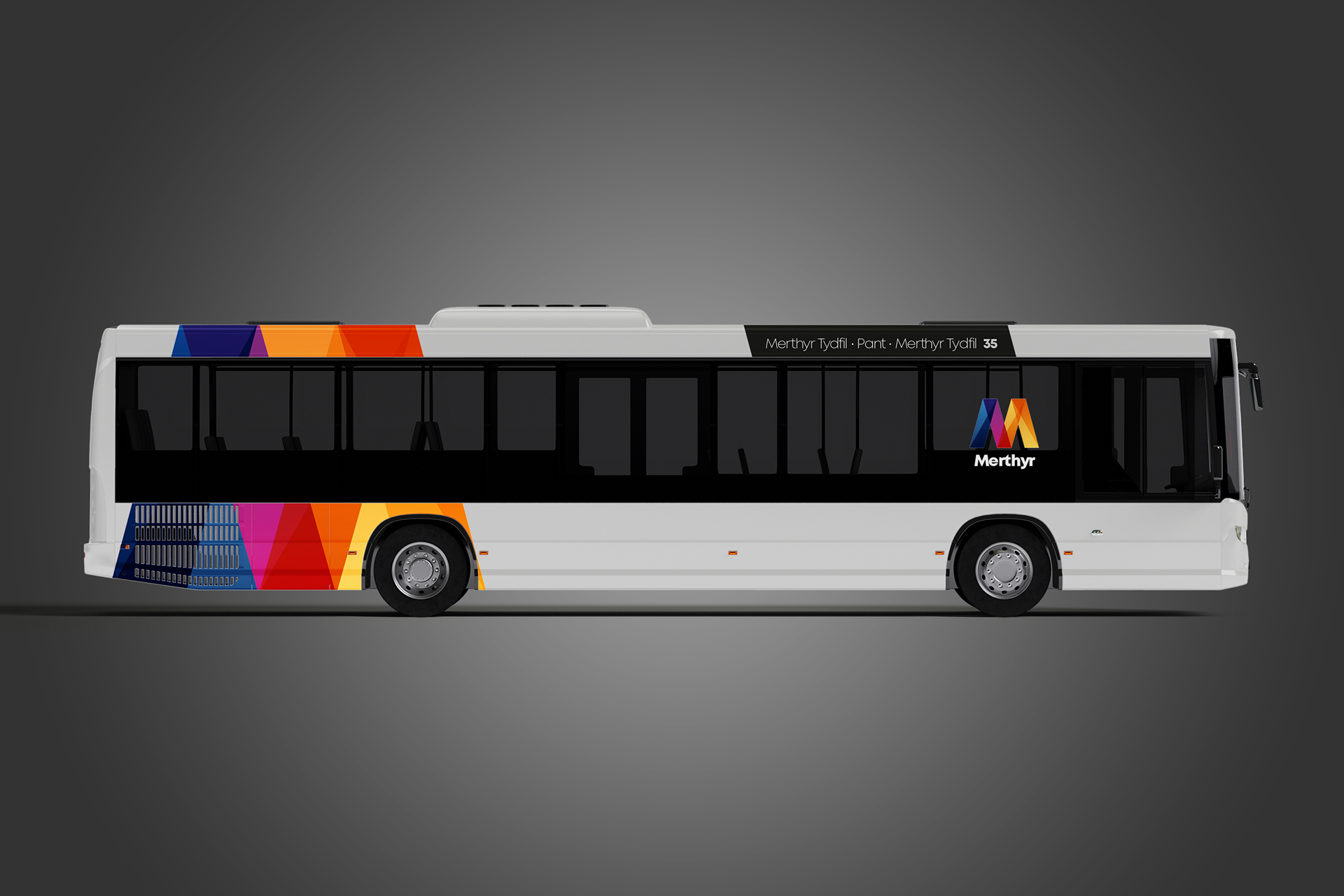
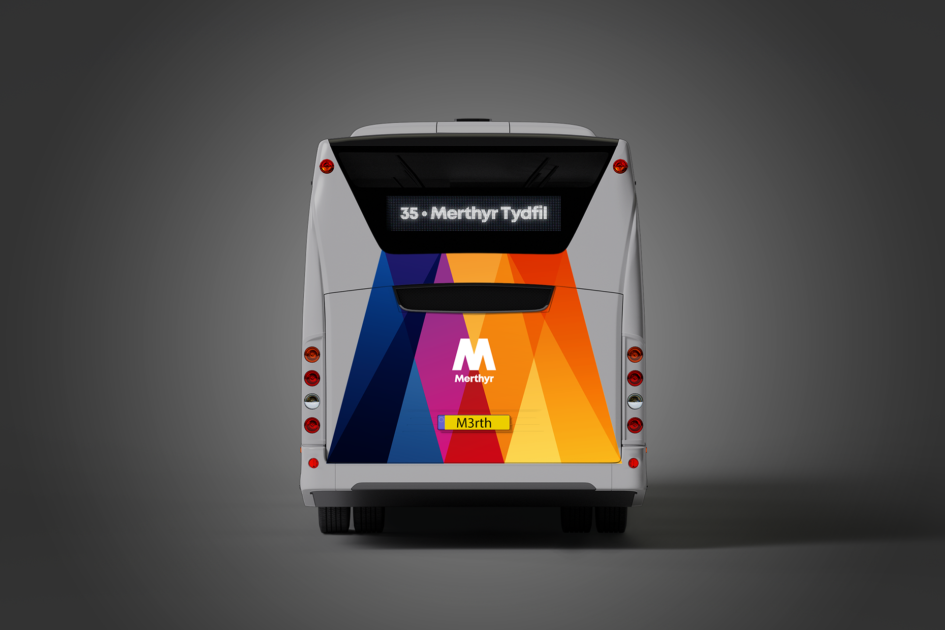
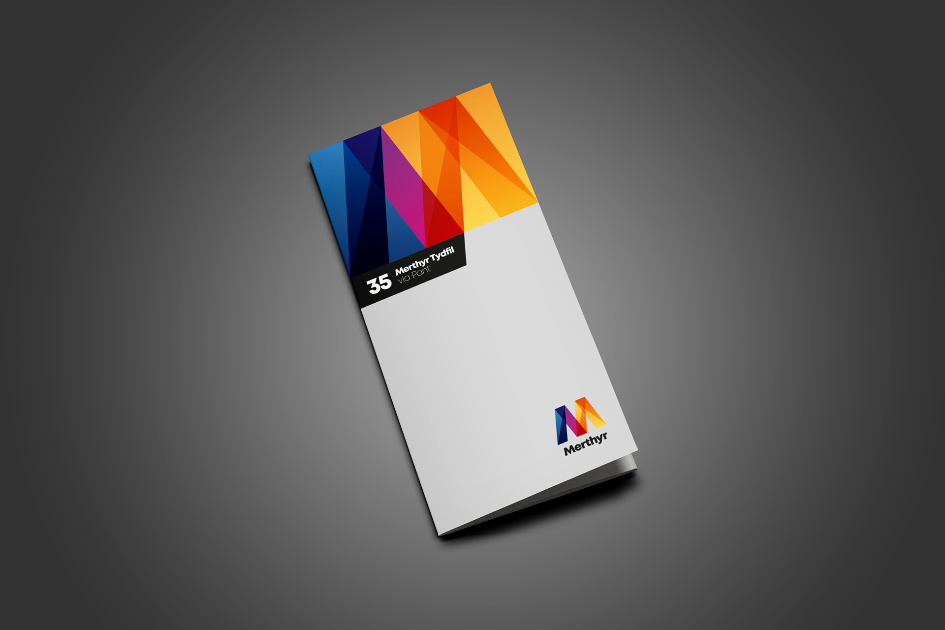
The identity is relatively simple, yet instantly recognisable and is shown in a wide spectrum of colours, each colour segment split using angles representative of the letter M itself and achieves almost immediate standout.
The livery required a neutral base to contrast this kaleidoscope of colour and a subtle, modern grey was chosen to do the job. Looking at the livery as a standalone piece of communication, I’d like to think the result is pretty self-evident.
Add a new timetable design into the branding equation and you can clearly see this suite of communication taking shape.
If industrial towns are synonymous with the colour grey, this new, improved Merthyr Tydfil Transport is doing its best to brighten things up.