From a branding perspective, Strathclyde’s Buses was the easyJet of its day — it would transport you around the city of Glasgow in any colour, as long as it was orange. And if there is one thing that easyJet is known for, it is its distinctive and memorable branding.
Did we dare say orange? In a city where orange is not just a colour but can also be a statement of tribal allegiance to one side of a sectarian divide, the official name of the colour applied to Glasgow’s buses was ‘Strathclyde red’. This was red as in the colour of ginger hair or the sandstone from which many of its buildings were made, but yes it really was orange, if not in name.
Orange and black had become the livery of Strathclyde PTE in 1983, replacing green and yellow colour combinations that also were tribally significant, and it remained largely unaltered with the creation of the arms length Strathclyde’s Buses three years later. It survived the company’s sale to a management/employee buyout in which Stagecoach took a minority shareholding, but was phased out after FirstGroup took over in 1996 and adopted a dark shade of red. Real red. Not orange pretending to be red.
Red did not last long, as First’s introduction of a corporate livery — ‘Barbie’ magenta, dark blue and off-white — began towards the end of 1997 and its Glasgow buses were coloured much like those elsewhere.
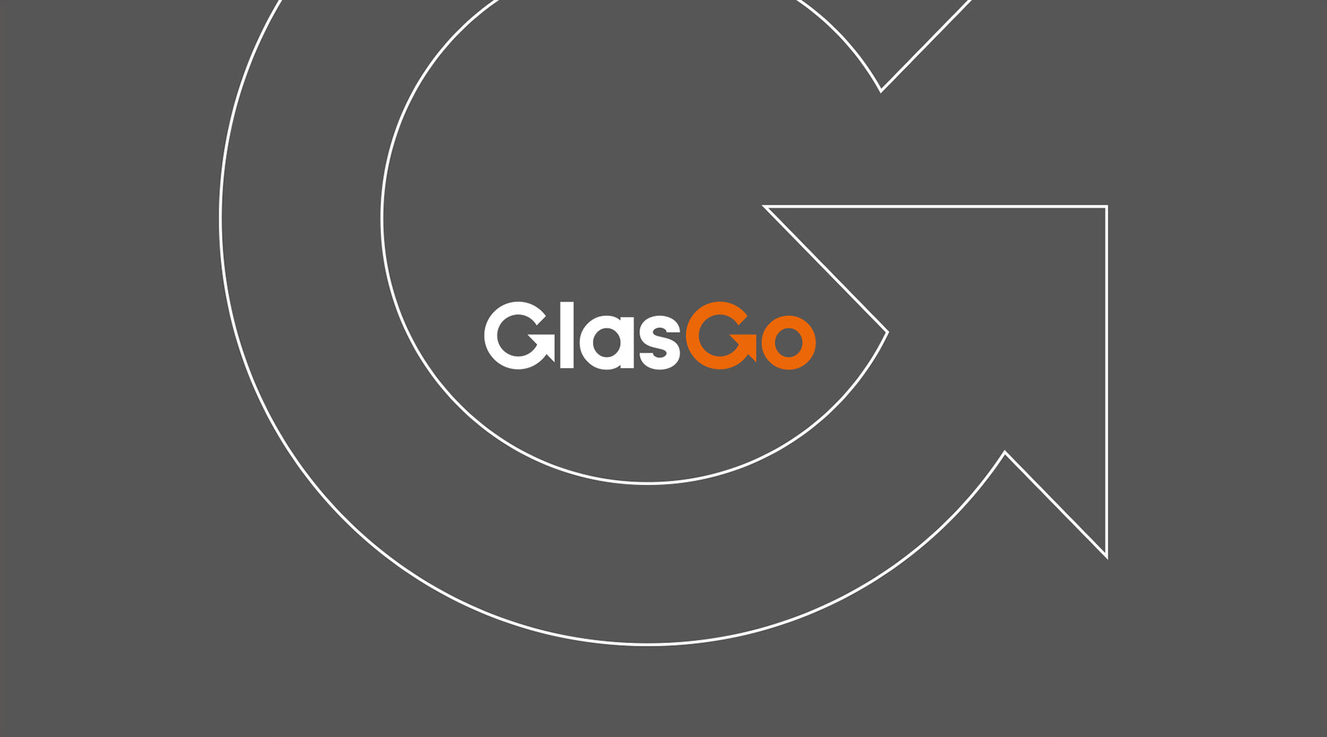
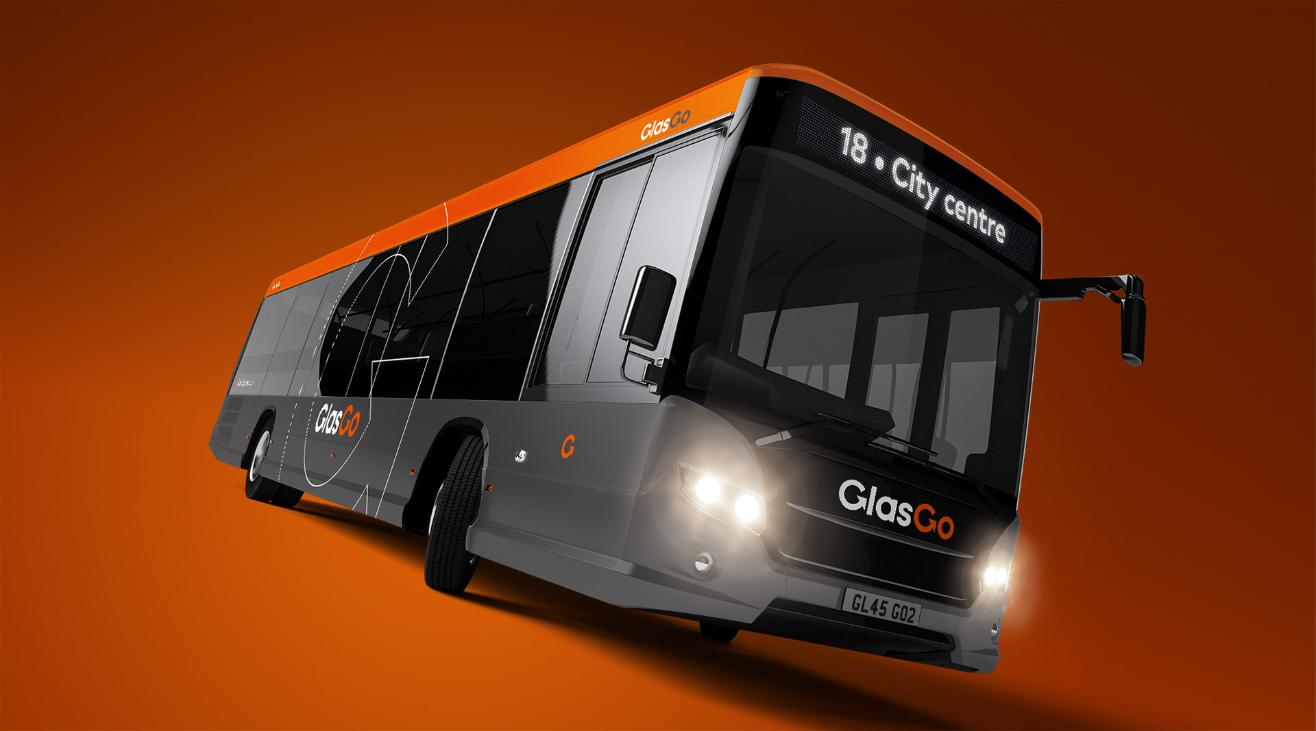
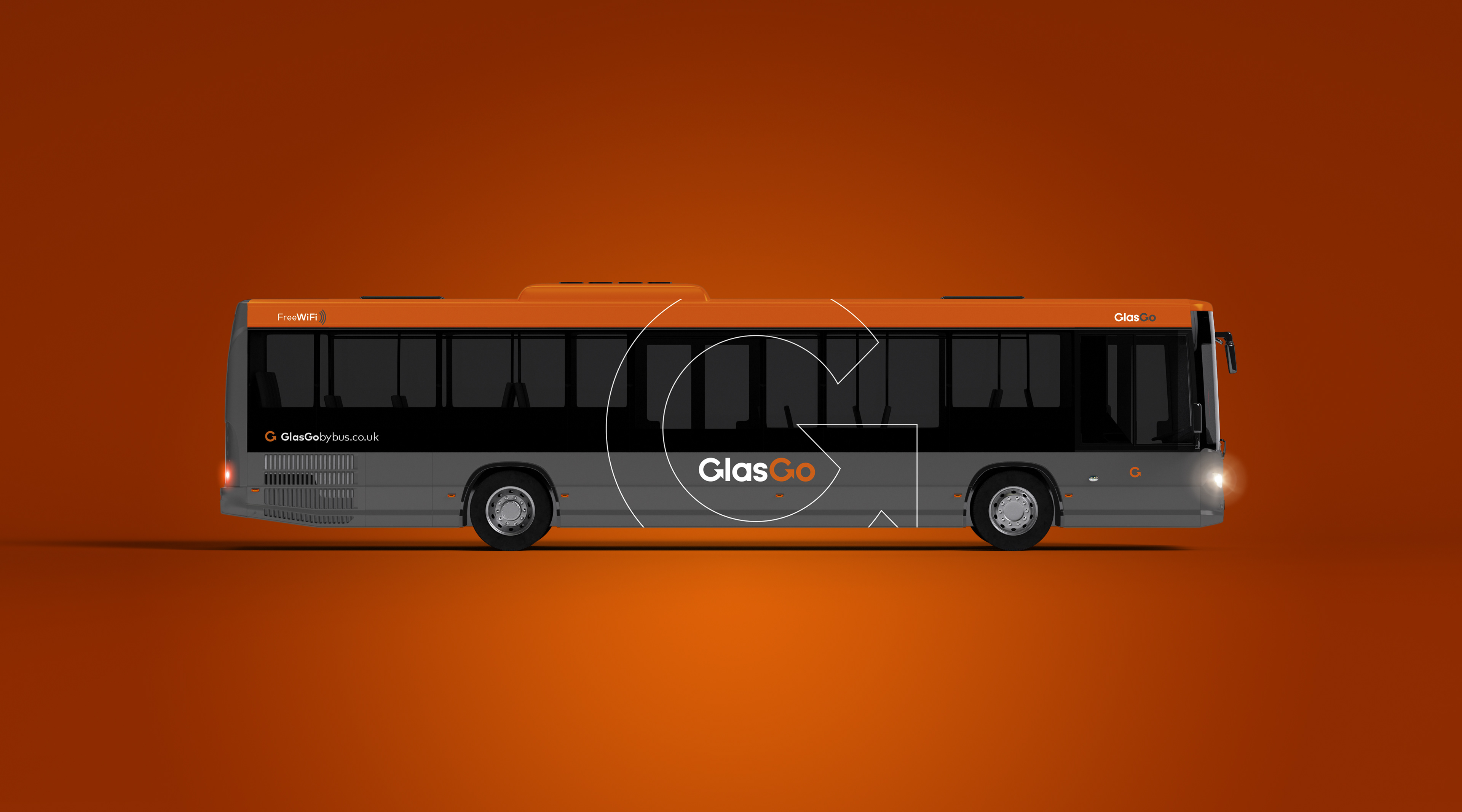
So when it came time for us to imagine a reinvented local livery for Glasgow, we had little hesitation in returning to 1983 and a shade of orange.
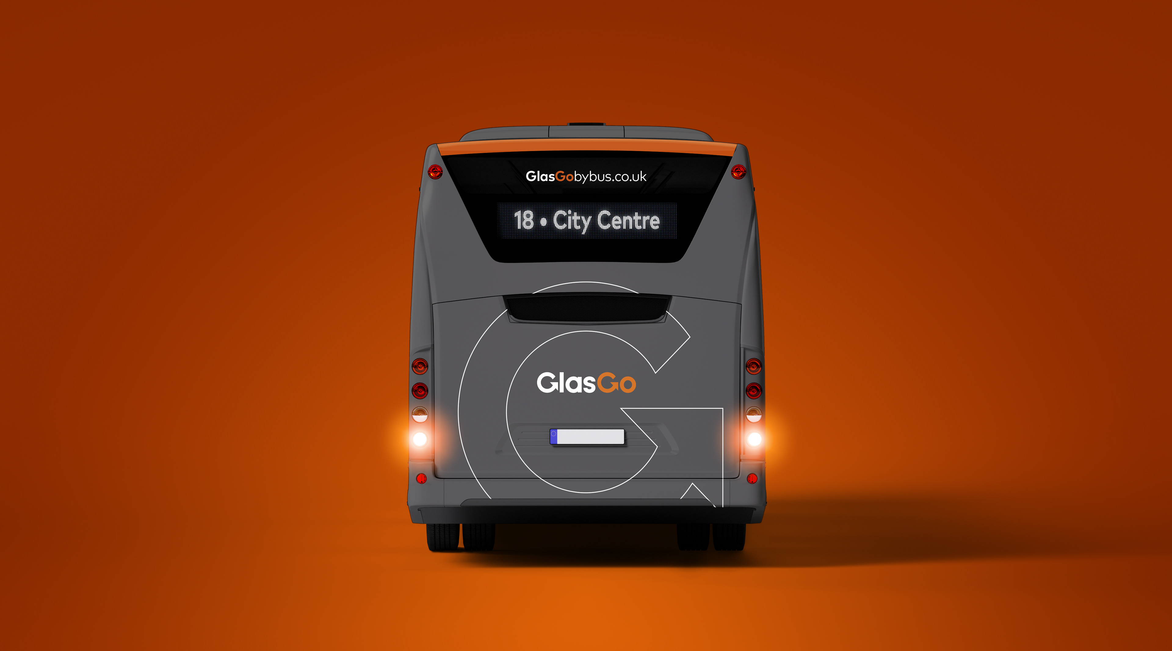
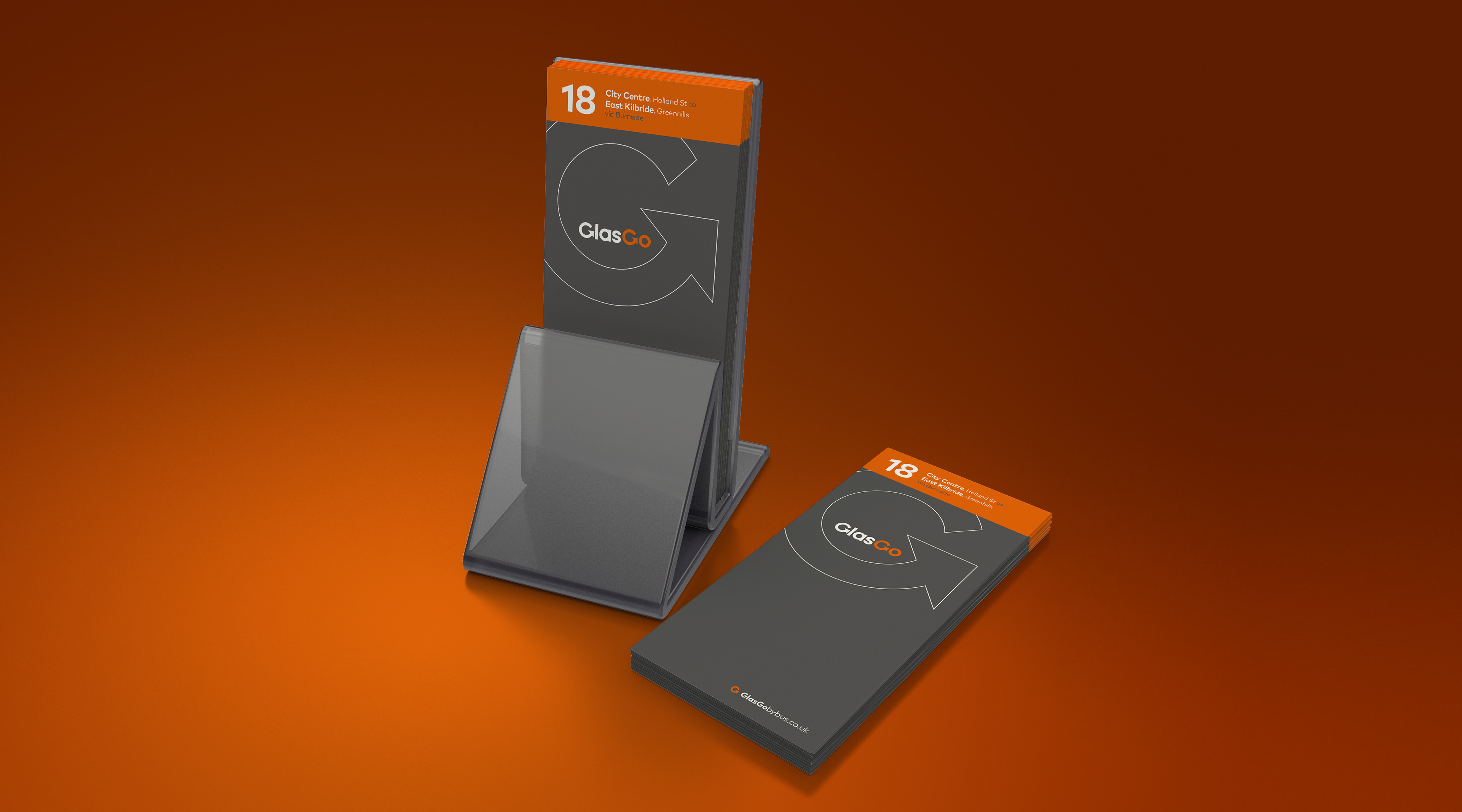
Our approach was to pay lip service to the original orange by retaining it as a secondary colour but contrasting it with a refreshingly dominant, yet modern deep grey.
While many see grey as an isolated dull colour, its neutrality allows other, more vibrant colours to really come into their own. When used in tandem with a grey cousin, the likes of orange, yellow, green, pink and turquoise all come into their own and really stand out on a livery or piece of advertising.
The identity itself is a straightforward sans serif font containing a bespoke letter G — stylised to denote this a company that is going places. Sitting smack bang in the middle of the wheelarches and timetable cover, it’s hard to miss and easy to recognise.
As seems commonplace with these rebranding projects, the original name was a mouthful and not ideally suited to communicating with the modern day consumer. The streamlining process led us from Strathclyde’s Buses on to Glasgow Bus before ending up at a much simpler GlasGo. Add the words ‘by bus’ and you create a URL that rolls off the tongue at pace.
So, remember, if you’re in Glasgow and need to travel by bus, just look for the big G. Easy as that.