Here's how we invented a new image for the buses of West Bromwich...
The West Midlands town — whose football team rejoices in the nickname the Baggies — ran its own municipal buses from 1914 until the region’s passenger Transport executive took them over in October 1969 along with those of Birmingham, Walsall and Wolverhampton.
Forty-seven years on, it is the West Brom depot of National Express West Midlands, its buses painted in corporate red and white or the new two-tone red with gold.
But suppose none of those changes ever took place and the buses were still in local ownership. How might they look?
For most of their years in municipal ownership, they were two-tone blue and cream. In 1967, a new livery of cream with light blue bands was introduced for its first rear-engined vehicles.
More so than with any livery produced for Identity Parade so far, we’ve gone for a complete branding overhaul as opposed to an evolution of a brand that was tired. Sometimes it’s good to start again with a blank piece of paper and not be restricted by the past.
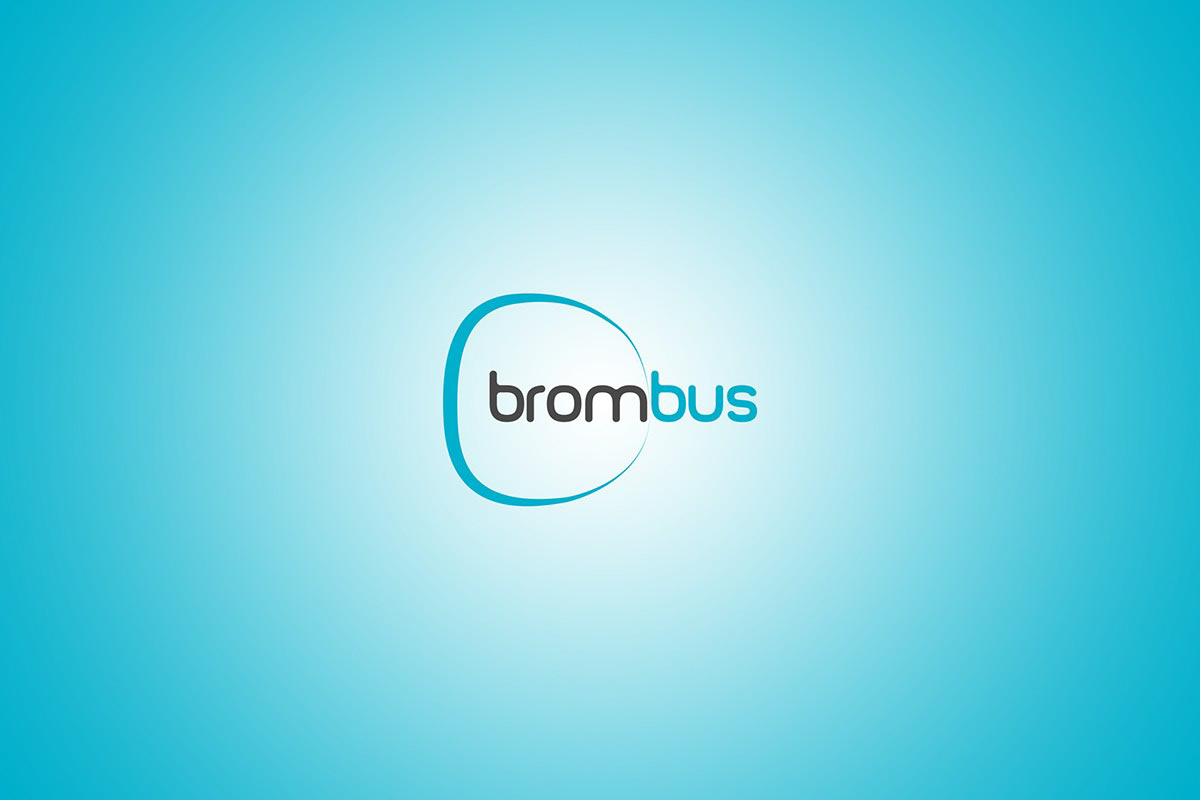
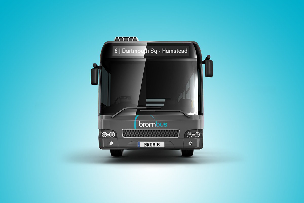
The name West Bromwich Corporation Transport, unfortunately, is neither catchy nor current, so the first task was find something with a bit of snap to it. Something that was easy to say and could stick in the mind and eventually the name “brombus” became a clear favourite amongst the creative team.
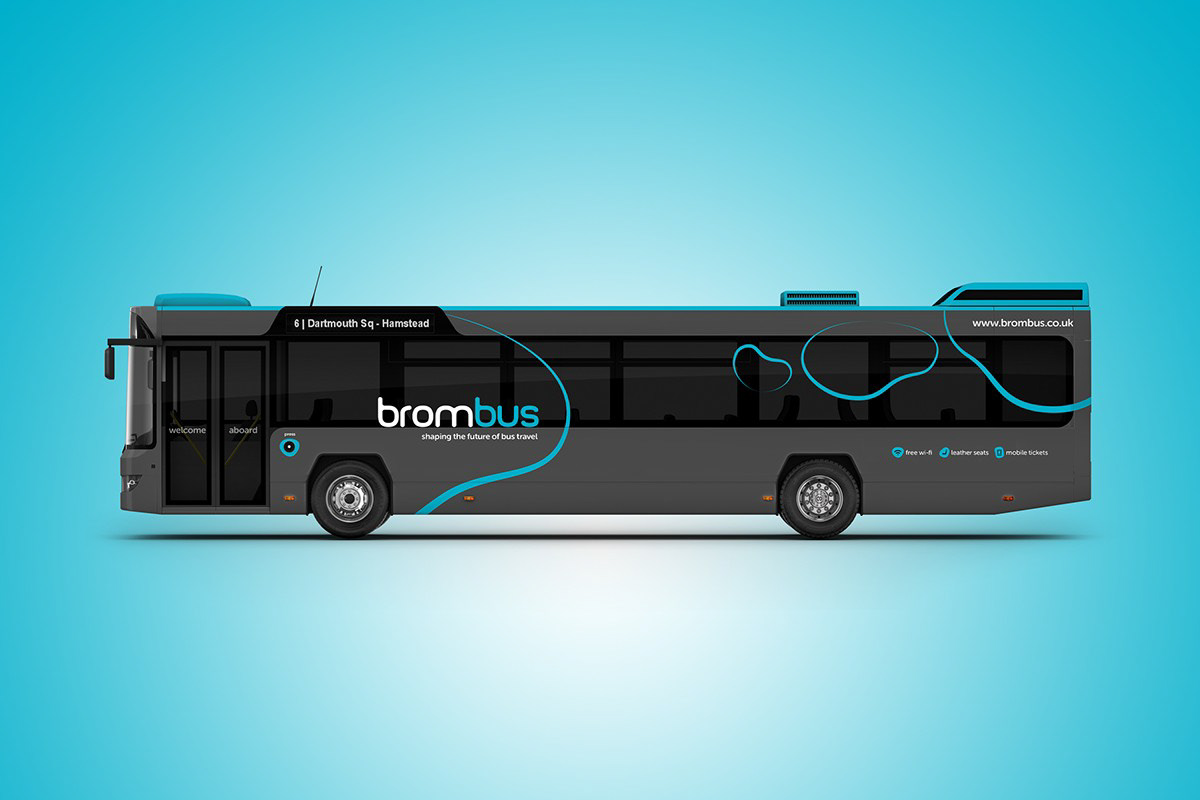
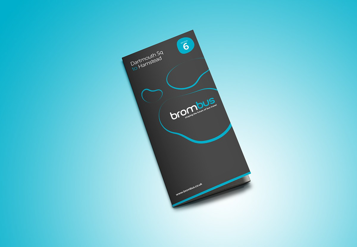
With regards to branding influences, the original name didn’t lead us in any particular direction, so our attention turned to the West Bromwich area itself. Inspiration came from an iconic building, The Public, designed by maverick architect Will Alsop. This critically acclaimed building was at the forefront of a regeneration project for the area. With its irregular, fluid-shaped windows it challenged conventional architectural thinking. So we chose to use these dynamic, fluid shapes as the basis of the new brand.
The irregular nature of these shapes gives them an almost futuristic, liquid quality, meaning they can be used in whatever size, form or colour would benefit a particular route or placement. There are no set rules; it is an organic, adaptable and modern brand.
The new Brombus logo uses a modern typeface that was then customised and rounded to allow it to work together with the shapes themselves.
When it came to the choice of colour, the team did pick a link with the past. The colour scheme of vibrant electric blue and white really punches out of the contrasting dark grey paint, offering a striking alternative to the average bus on the streets.
The strapline, “shaping the future of bus travel” summarises not only the design but the brand’s promise to the people of West Bromwich.