Grampian Regional Transport was the company that gave birth to today’s First Bus.
The company created in 1986 to operate Aberdeen’s municipal buses at arm’s length from Grampian Regional Council was sold to a management/employee buyout in January 1989.
It wanted to protect itself from the emerging big groups and instead turned itself into what for a time was the biggest group of all, FirstGroup, with operations across the UK, North America and toeholds in Europe.
Until First adopted a uniform UK bus livery at the turn of the 21st century, Aberdeen’s buses (and trams before them) were green and cream. Grampian added a stripe of orange when local government transferred them from the city corporation in May 1975, but they became green and cream again in the 1980s and the arm’s length GRT adopted a two-tone green version with a kick-stripe towards the rear.
This became the corporate style as the privatised company expanded south, but in different colours to respect local traditions: two-tone blue at Midland Bluebird; two-tone green at SMT and Lowland; two-tone red at Leicester and Northampton; red and orange at Eastern Counties.
Then GRT merged with Badgerline to create First in 1995 and two years later the magenta, pink and off-white ‘Barbie’ livery began to create a uniform identity across all fleets, including those in the group’s headquarters city of Aberdeen. The Grampian name gave way to First Aberdeen.
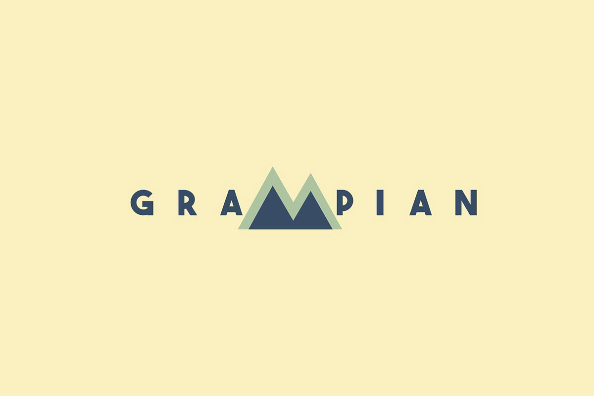
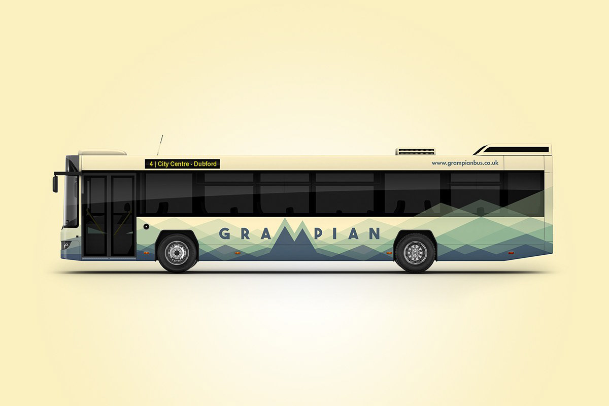
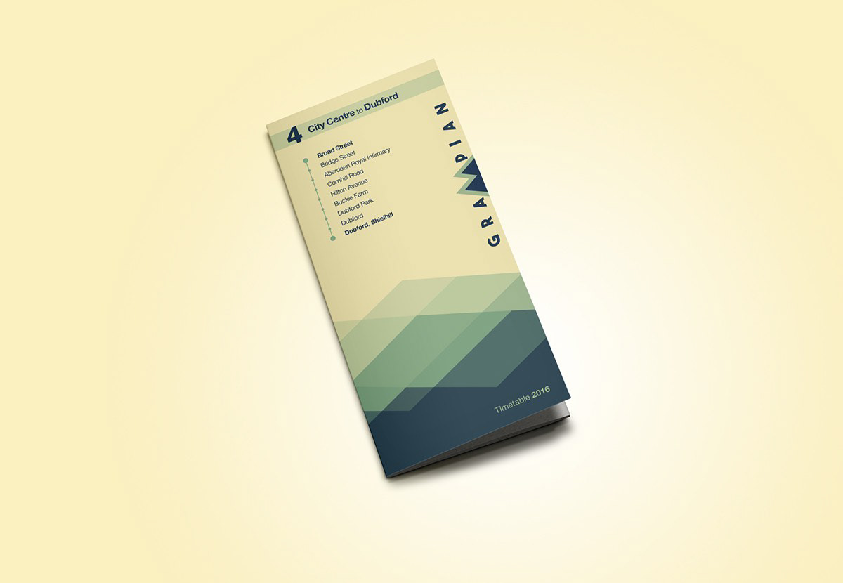
So how might things have looked had Grampian have stayed Grampian and kept its buses green? We took on the challenge...
It was hard to separate Grampian from the striking landscape from which it was named. Therefore, it was an obvious choice to develop an identity and livery with the imposing grace and beauty that is associated with the geography. The challenge was to simplify such a mountainous landscape into a friendly graphic that could form the basis of future marketing communication.
The logo is a simple uppercase, bold font with exaggerated spacing, reassuring the customer that Grampian is a reliable, dependable company. The colours used are similar to the original livery, providing that vital link between old and new.
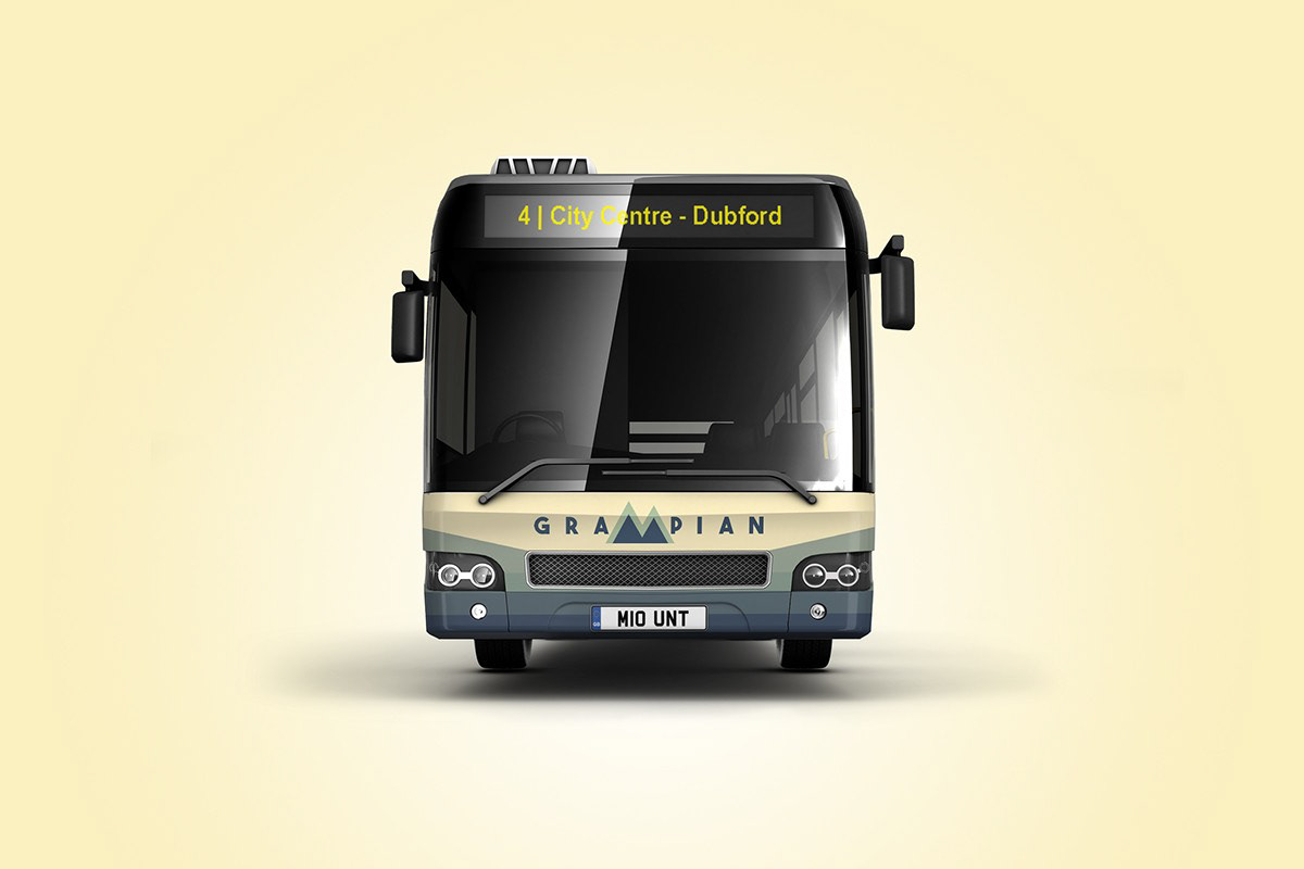
The ‘M’ graphic within the brand name is depicted as a straight edged mountain shape in the centre of the new identity, which has also been incorporated in the design of the livery. The mountain scape has been formed by carefully layering subtle shades of green and grey/blue, giving the design depth with an overall sleek soothing result. The lines and patterns have been made slightly irregular, producing the varying spaces and shapes that would be seen in the natural landscape.
The background has been lined up symmetrically from the centre of the identity to make a focal point on the bus’s body, meaning it can be painted in a single base colour and vinyl used to display the graphics.
As the vinyl is very slightly opaque, limited contra-vision has been used, which although loathed by some, adds a nice continuation in the tonal shades of the horizon.
The finished livery design is quietly majestic with echoes of the landscape it is based upon, yet maintains a contemporary feel derived from the geometric approach. The identity is sturdy and strong and makes a step in the right direction for this company’s re-branded future.