
As with many of these projects, the first stumbling block was the name – West Yorkshire Road Car Company. It does not exactly roll off the tongue, does it?
We suspect that the same question arose 30 years ago when the state-owned company faced the challenge of deregulation and passed into private ownership.
The history is that it started out as a steam bus operator in 1906 called the Harrogate Road Car Company. As it fulfilled wider ambitions, it became Harrogate & District Road Car Company in 1924 and three years later became West Yorkshire Road Car. At that rate of expansion, by now you could imagine it being like one of those children’s addresses that end with the Universe or the Milky Way.
But it stuck as West Yorkshire Road Car, in state ownership from 1948 until Alan Stephenson, managing director of East Yorkshire Motor Services, teamed up with some of West Yorkshire’s managers to buy it in August 1987 for his AJS Group.
It started out with a retro red and cream livery with gold leaf traditional fleetname, but soon was split up into separate parts, which were sold variously to Yorkshire Rider and a management buyout called Blazefield. Today, its component parts are run by Transdev and First.
But if all that had not happened, how would we have spruced up West Yorkshire Road Car?
The solution, which formed the basis of the new brand’s positioning, came in the shape of a question asked by many. Why should I get the bus? In this case, because it’s a bus that will do the basics — simple fare structure, contactless payment, high frequency, courteous drivers, reliable punctuality — to a consistently high standard, day in, day out. The objective being to make public transport a viable option, rather than a necessity.
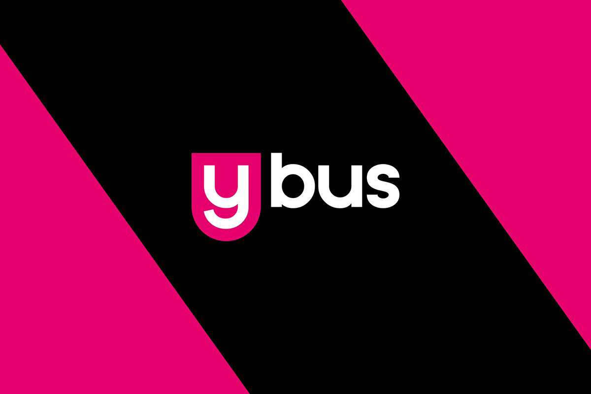
So in case you were wondering, that’s how West Yorkshire Road Car Company became simply “y”. The name is playful, doesn’t take itself too seriously and above all forms a memorable statement of intent.
Such a name deserves a branding execution to suit and choosing a suitable “y” for the brand’s icon was a challenge. All the uppercase options were straight and symmetrical, whereas we wanted something more approachable, a logo that would smile and entice people on board.
The option we chose, a lowercase font in medium weight, delivered on every level. The icon was then housed in a shape that mirrored the font’s outline and subsequently created a real badge of honour for the brand.
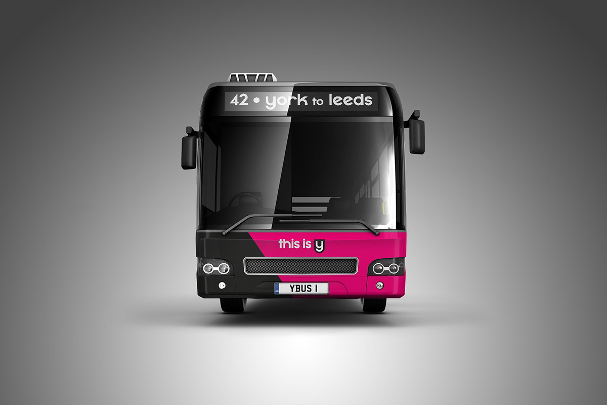
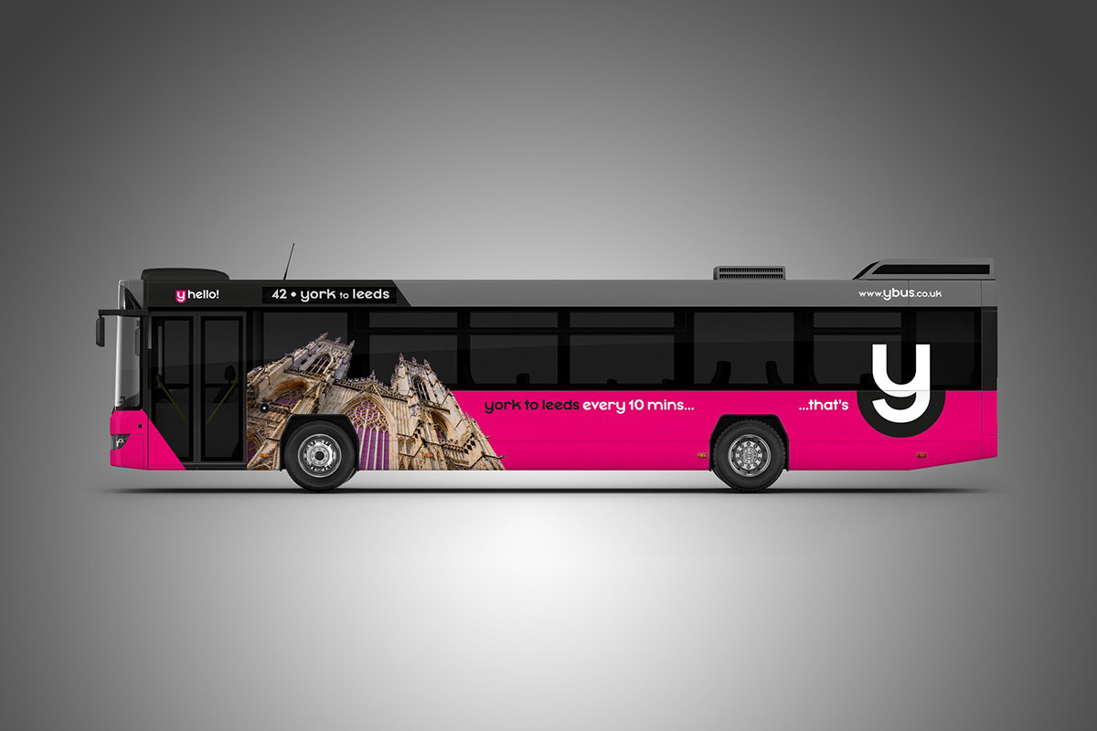
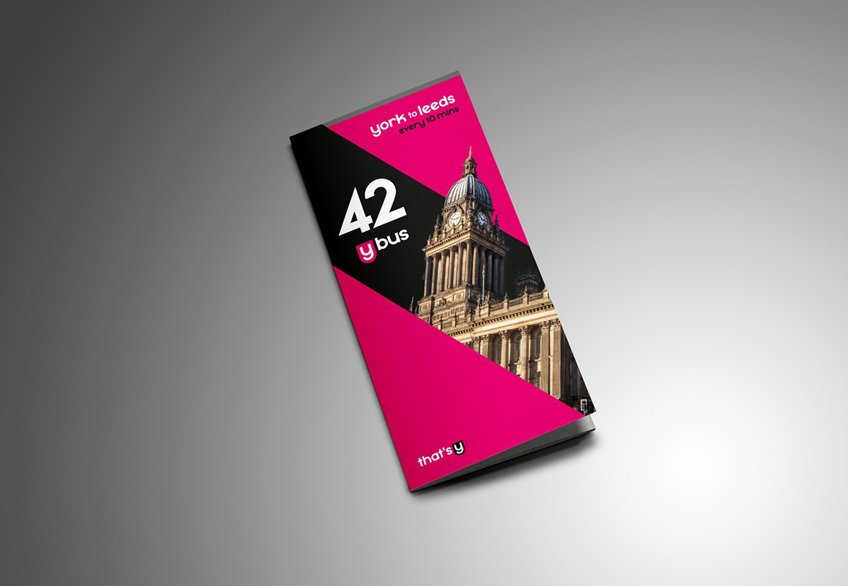
Given that the original colour scheme for these particular buses was a traditional red and cream, a 21st-century look was needed urgently, and a vibrant, sexy pink seemed a natural choice.
Because the mainstay of the livery is relatively straightforward, a bold route landmark image was added at an angle to provide a striking contrast to the flat background colours. This angle has been followed through on the front of the bus and timetable, epitomising brand consistency for the customer.
So another brand from yesteryear comes back to life to serve the good folk of Yorkshire. And I can think of lots of reasons “y” they would be happy about it.