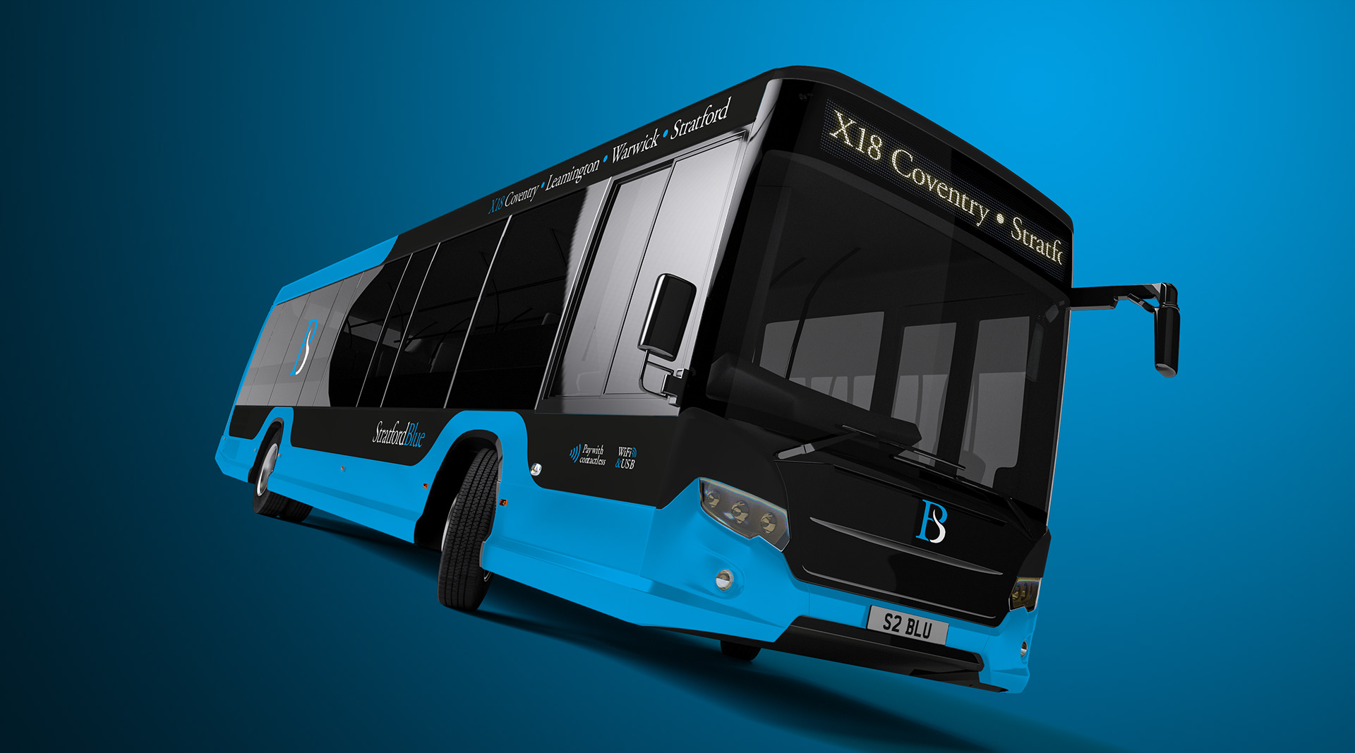
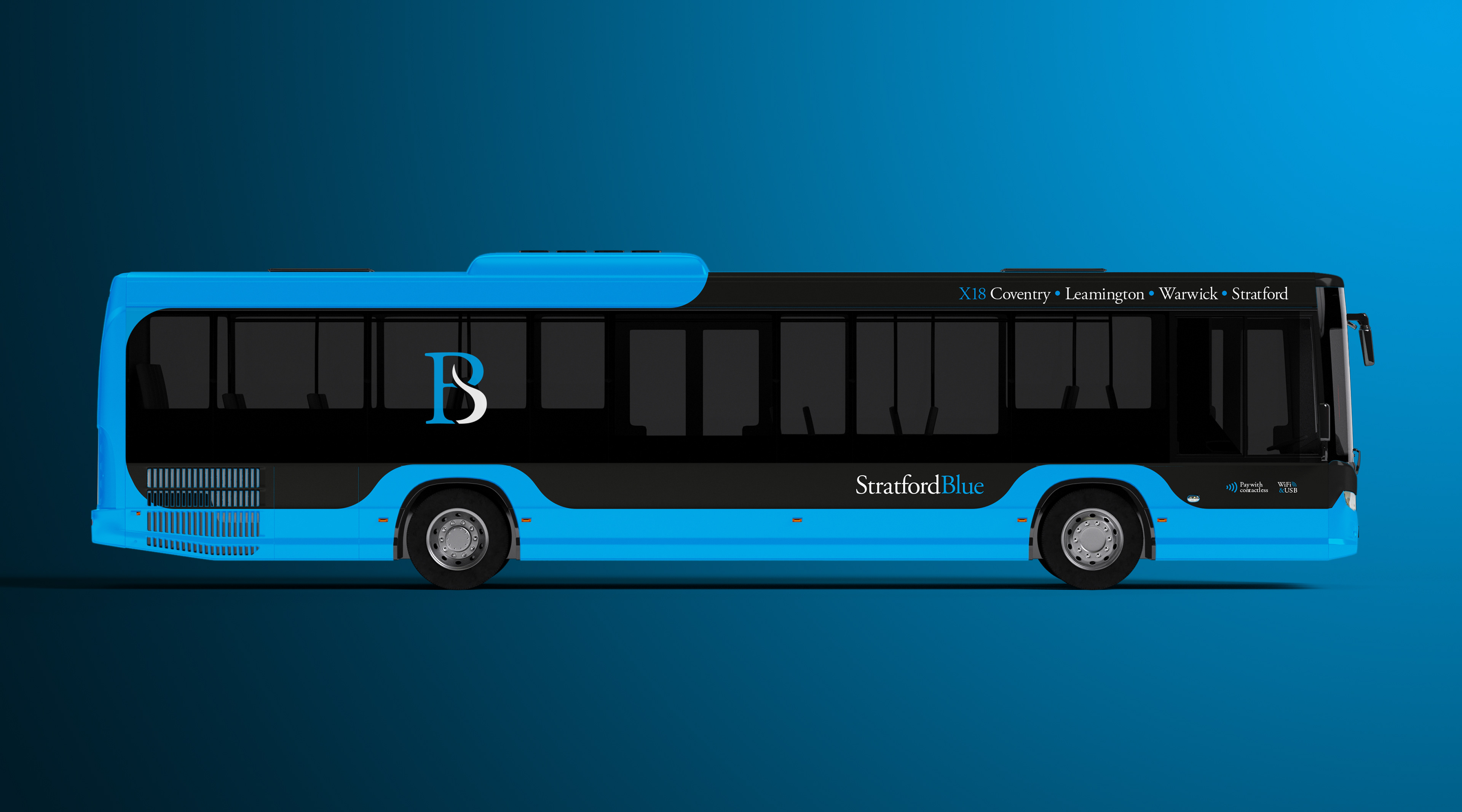
We visit the Midlands to take inspiration from the River Avon in bringing Stratford Blue back to life.
And for once, we've kept the company name as it originally appeared.
For this imagined remake, blue remains as the dominant base of the livery but works alongside a white and black palette.
The livery itself delivers a silhouetted letterbox effect thanks to the wrap around blue encasing most of the bus’s frame, which is especially effective over the wheel arches.
The Stratford Blue wordmark complements the blue colouring and is shown in a more modern title case, serif execution.
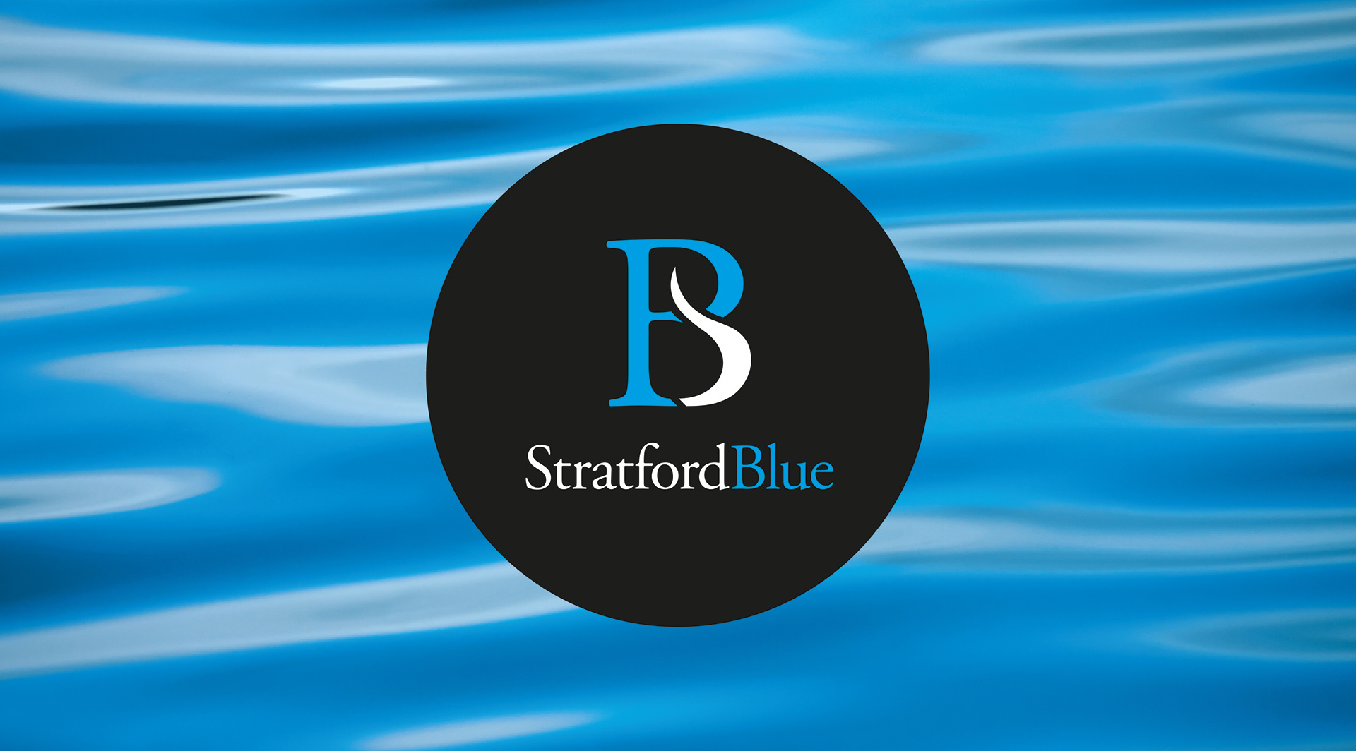
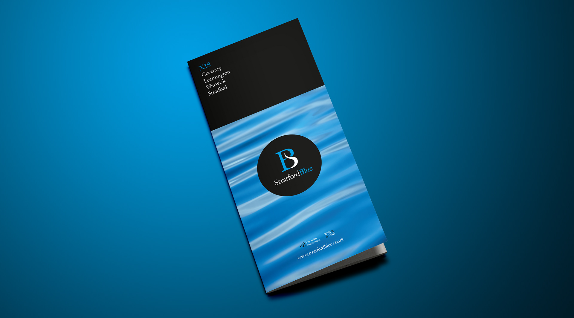
The company’s new identity has been crafted through a subtle combination of the S and B, with the former designed to represent the iconic river that flows through this beautiful town.
The branding carries seamlessly through to the timetable cover, although we have introduced a water effect for some simple stand out. Coupled with the black band at the top, this ensures that this leaflet will take on all comers when racked and vying for attention.
Stratford Blue may well serve a historic town with bus services, but is doing so with modern branding.