

When we first looked at the old OK Travel branding we weren’t convinced that continuing to have the word OK in your name was the best way to go. Why would you claim to be just “OK”?
You’re not setting standards of a premium brand, nor are you clearly targeting the lower end of the market. You are, by default, all set to become a “nothing” brand. And what bus company wants to be one of those?
So how did we get around this problem? We flipped it and turned it into a positive by adding the strapline “the modest bus company”. Suddenly the whole concept of the company’s attitude changes. It goes from “we are average, and we’re quite happy with our lot in life” to “look, we know we’re a good little bus company but we don’t want to shout about it too much if that’s all right with you”.
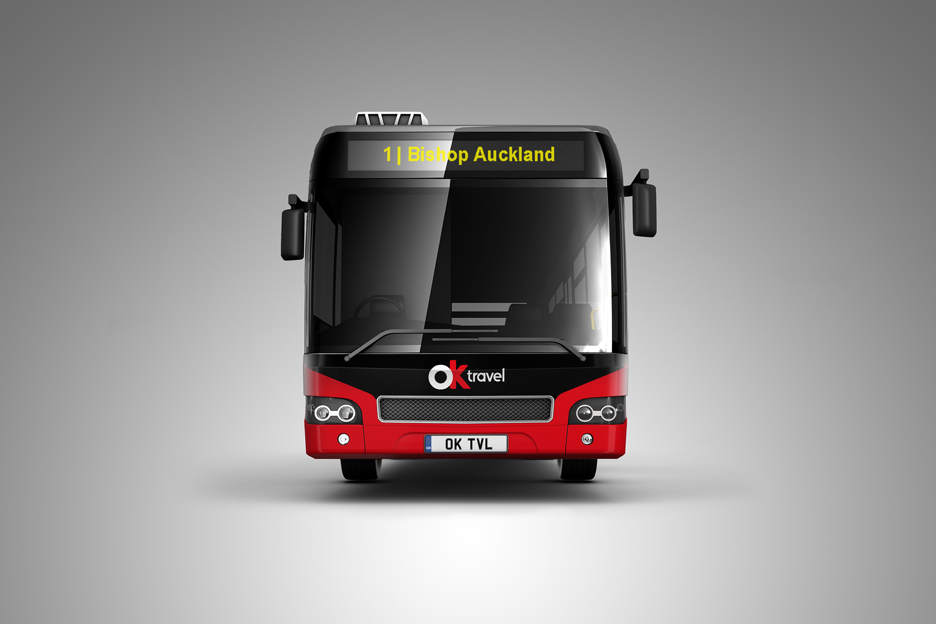
A lot of time and effort was also spent investigating how the O and K letters would work together, concluding that a simple two letter word could actually be treated more as a shape.
A simple lower case approach was chosen to look friendlier (and less like a certain celebrity magazine) and the colours of the O and K are in stark contrast to each other for real stand-out in the brand’s communication. The K has been softened by rounding off some corners and subtle curves used on the word ‘travel’ to complement.
The original OK Travel livery was a mix of red and cream. Our updated version keeps the red, but brings a more contemporary feel to proceedings by ditching the old fashioned cream and replacing it with black and white.
When designing liveries, the biggest restriction is always the windows as they reduce the space available and generally end up like a black hole in the design. We’re always keen to reduce the use of contravision too, so for the benefit of the customer we tried a different technique here.
We have incorporated the windows in the design by using black vinyl to extend them and create the illusion of a sculpted, sleek body for the bus. The diagonal lines and smoothed corners make a regular bus look much more dynamic, and particularly striking on the roads.
Through the use of flat base colours, this design would be relatively easy to execute and maintain on a bus, while the logo and web address would be straightforward vinyls. The okletsgoco.uk web address adds a little personality to the overall effect, leaving the new livery to compete with the best bus travel has to offer.
Through the application of a few simple principles, life has returned to a dying brand.
You’re not setting standards of a premium brand, nor are you clearly targeting the lower end of the market. You are, by default, all set to become a “nothing” brand. And what bus company wants to be one of those?
So how did we get around this problem? We flipped it and turned it into a positive by adding the strapline “the modest bus company”. Suddenly the whole concept of the company’s attitude changes. It goes from “we are average, and we’re quite happy with our lot in life” to “look, we know we’re a good little bus company but we don’t want to shout about it too much if that’s all right with you”.
A lot of time and effort was also spent investigating how the O and K letters would work together, concluding that a simple two letter word could actually be treated more as a shape.
A simple lower case approach was chosen to look friendlier (and less like a certain celebrity magazine) and the colours of the O and K are in stark contrast to each other for real stand-out in the brand’s communication. The K has been softened by rounding off some corners and subtle curves used on the word ‘travel’ to complement.
The original OK Travel livery was a mix of red and cream. Our updated version keeps the red, but brings a more contemporary feel to proceedings by ditching the old fashioned cream and replacing it with black and white.
When designing liveries, the biggest restriction is always the windows as they reduce the space available and generally end up like a black hole in the design. We’re always keen to reduce the use of contravision too, so for the benefit of the customer we tried a different technique here.
We have incorporated the windows in the design by using black vinyl to extend them and create the illusion of a sculpted, sleek body for the bus. The diagonal lines and smoothed corners make a regular bus look much more dynamic, and particularly striking on the roads.
Through the use of flat base colours, this design would be relatively easy to execute and maintain on a bus, while the logo and web address would be straightforward vinyls. The okletsgoco.uk web address adds a little personality to the overall effect, leaving the new livery to compete with the best bus travel has to offer.
Through the application of a few simple principles, life has returned to a dying brand.