
Merseybus was the trading name of the arms length company set up 30 years ago to take over most of the 1,200 buses of Merseyside PTE.
Strictly speaking, it was Merseyside Transport Ltd (sometimes abbreviated to MTL), but Merseybus tripped more easily off the tongue. The largest concentration of its fleet was in Liverpool but the PTE had also run the former Birkenhead and Wallasey municipal operations on the Wirral peninsula and the smaller Southport and St Helens fleets after local government was reorganised in 1974.
It took Merseybus a couple of years to sort out a new identity for itself. The PTE had abandoned former municipal colours for Verona green and jonquil (bright green and cream) and the new bus company tried out a two-tone green scheme before settling for maroon and cream in 1988.
In 1993 it was sold to MTL Trust Holdings, a consortium of management and employees, and adopted a new livery of cream and red with a fleetname in red and blue. It later confined the Merseybus name to the Liverpool fleet, with separate names for Wirral Peninsula, St Helens and Southport, and for other businesses it either acquired or established.
The cream and red livery lasted until Arriva bought the business in 2000, but by then the local names had gone and even Merseybus was a moniker for museums, as it traded latterly as MTL North, a title that neither stumbled nor tripped off the tongue.
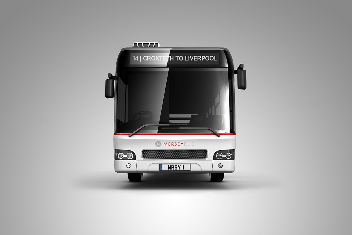
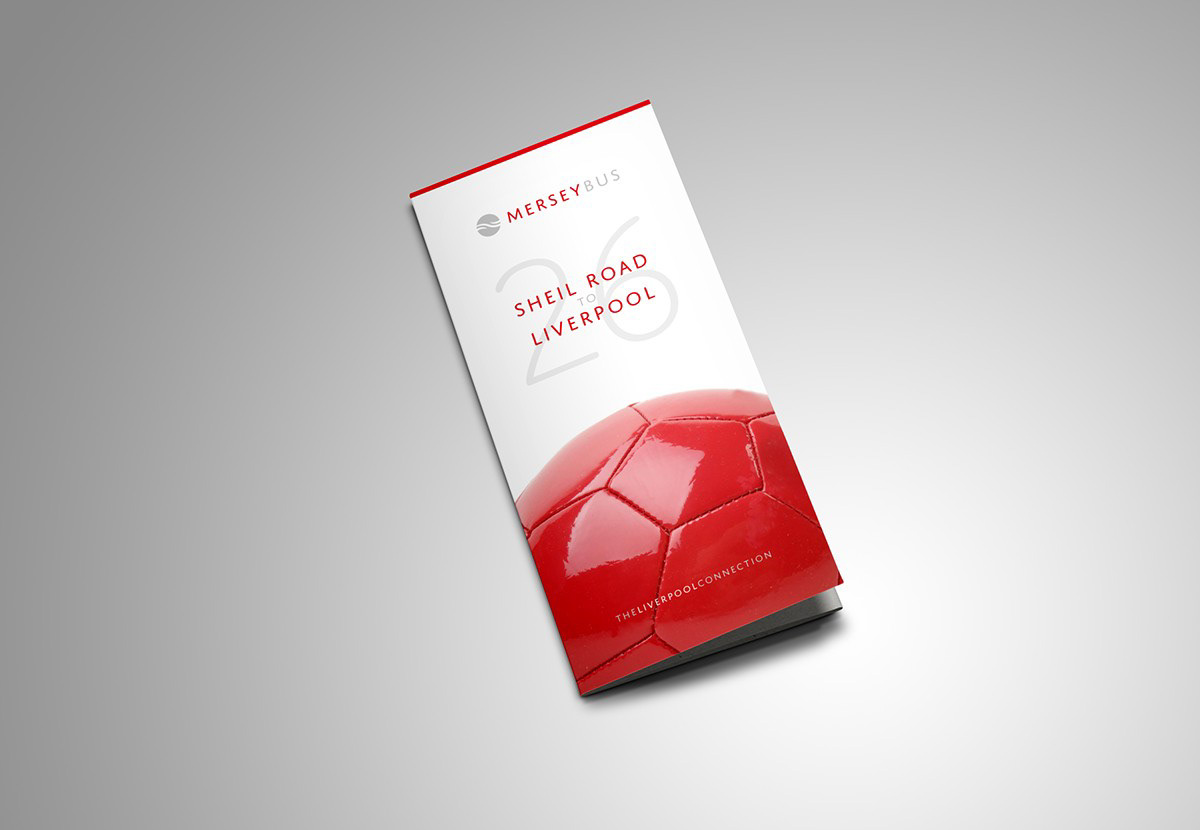
For this month’s Identity Parade, we've revives the now outdated Merseybus brand and transform it into a product fit for sale in 21st century Britain.
The company’s old identity loses its red/ blue colourway and is replaced with a red/grey combination, stylishly executed in a modern uppercase font with exaggerated letter spacing. This wording, coupled with a graphic icon representing Liverpool’s famous river and tunnel, instantly lifts the branding into the upper echelons of customer expectation.
The livery is understated, stylish, classy and resembles a piece of retail packaging seen in a respected department store. The rear of the bus is where this brand takes the opportunity to show a pride in the city of Liverpool — in this example paying homage to the city’s musical heritage.
The concept evolved so that each image used in the brand’s communication would relate strongly to subjects at the core of Liverpool’s own DNA. This thought process is reflected in a strapline of ‘The Liverpool Connection’ — connecting the people with each other, and the city with its history.
The timetable echoes the branding and style, looking more like a restaurant table topper than something you’d see racked in a bus station near Bootle. I’m not sure that’s ever been said about a bus company before, so it’s a rebranding job well done.