
Maidstone & District Motor Services was 100 years old in 2011. Or it would have been had it not been transformed into Arriva Kent & Sussex in 1997 and rebranded in the group’s aquamarine and Cotswold stone national livery.
For around half a century until 1972, its fleet was painted dark green and cream with a distinctive scroll fleet name. Then the National Bus Company’s corporate identity changed it to leaf green and white with a standard fleet name in block capitals with the NBC logo.
Privatisation in 1986 dropped the NBC logo and changed the colours to green with a bit more cream. Then in 1997, a few months before Arriva’s identity was revealed, a new dark green and cream came along with a remake of the old scroll fleet name.
In taking on the challenge to imagine that M&D is still around and eager to give itself a contemporary look, we may have made our most controversial move so far in this series of projects suggesting how buses should be branded for modern consumers.
The influence for this revamp of Maidstone & District was a straight-forward one – make it modern, and make it as different as possible.
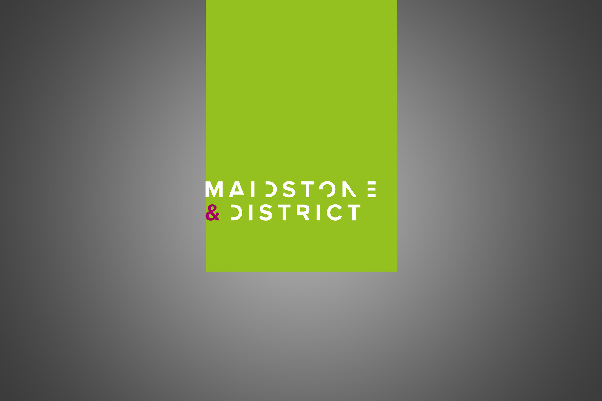
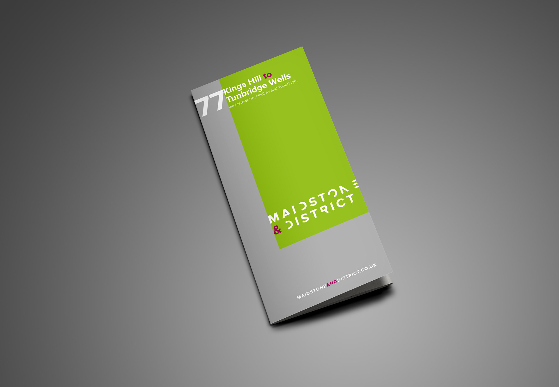
M&D’s original colours were typical of the era, but lack appeal for today’s modern consumer, and have received a significant update to keep with the times. Out goes the racing green/cream colour combination and in comes a palette that contrasts a refreshingly natural green with a more industrial metallic silver.
Using this fresh palette as our creative base, the branding evolved to deliver a real eye-catching identity. A sans serif font called Proxima Nova was chosen for its simplicity and used with exaggerated kerning, providing a real sense of space to the lettering. To further stylise the logo we then removed random pieces of some of the letters, which, along with the contrasting purple ampersand, instantly gives a distinguished look to the new identity.
Yes, it is slightly abstract and, yes, you have to work a little to put the pieces together, but it is modern and one you would not forget in a hurry. How many bus brands on today’s streets can you say that about?
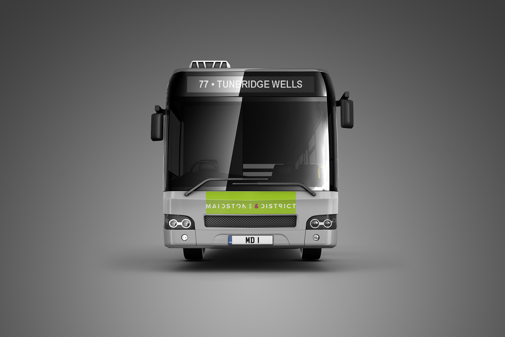
Taking advantage of the space available, working the identity into the bus’s shape was a relatively seamless exercise. It was run off both a vertical and horizontal straight edge, with the simplicity of execution contrasting the logo’s relatively complex construction.
The bus’s key benefits are easily identifiable at the rear and the use of the ampersand allows the brand’s playful personality to shine through.
The marketing collateral is completed with a striking timetable booklet, printed with a silver ink to allow the colour combination to pop out of the rack.
As you would expect, the branding elements from the livery are carried through to provide that clear consistency of look and feel.
The new Maidstone & District brand is a different creative beast to anything on the road today. Moreover, it is rightly proud to be so.