Transport for Greater Manchester plans to bring buses back under its control with a London-style franchising arrangement overseen by an elected mayor.
There has been no word of what livery they might wear, but we've created something appropriate for the new regime...
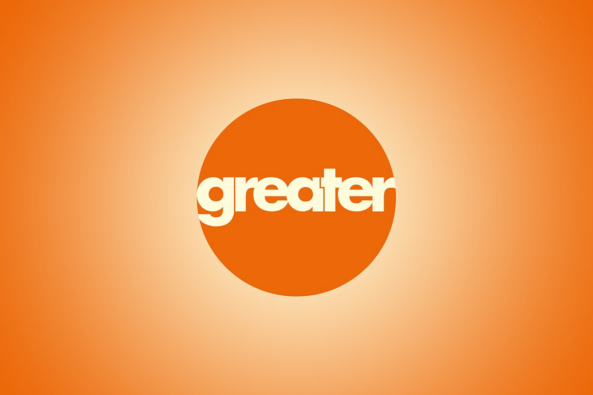
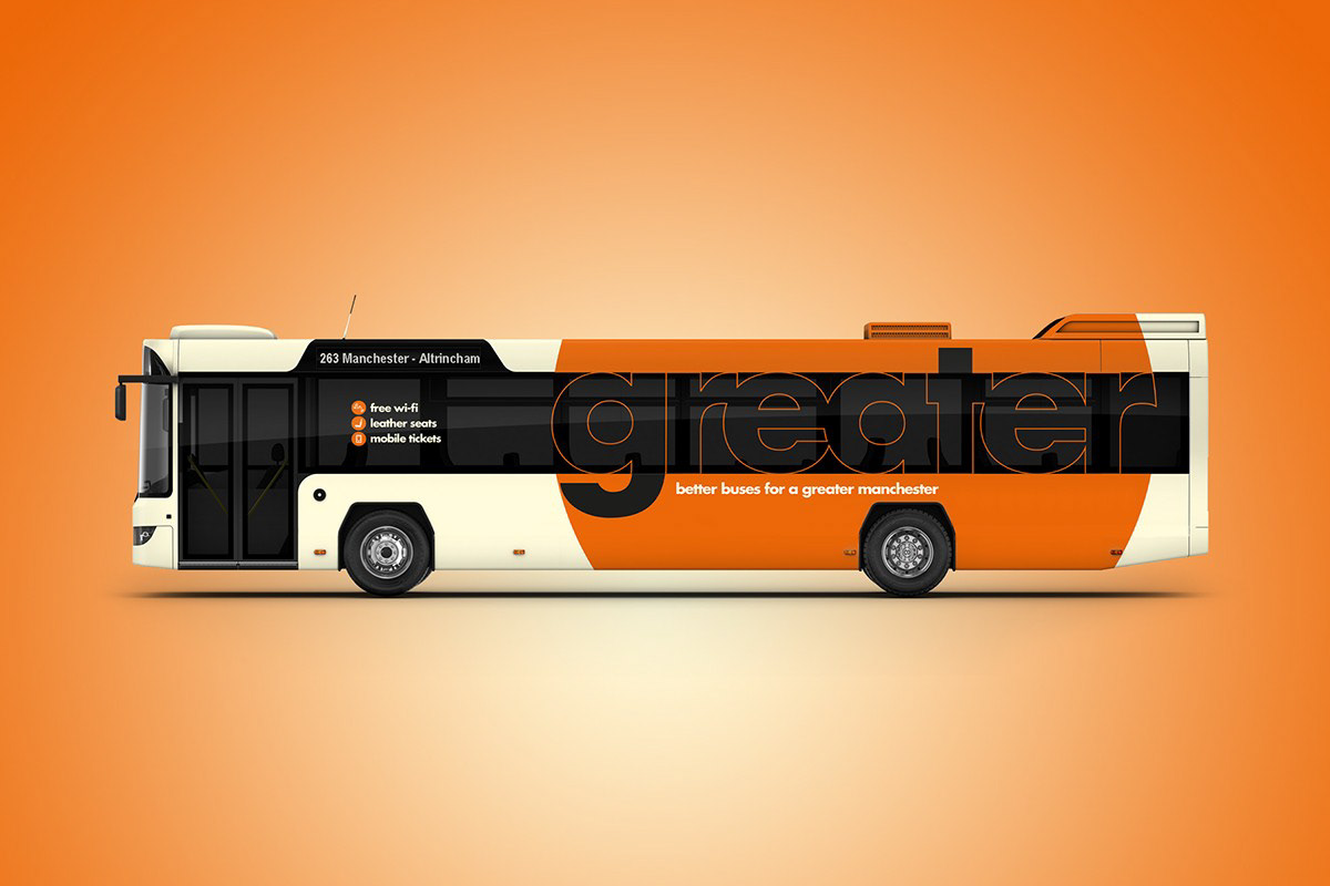
We had little hesitation in making the buses orange again, but with a shorter name. Greater Manchester Transport has become a simpler, punchier and more memorable “greater”. This simple adaptation works well with the double meaning of representing both the geography of Greater Manchester alongside the implications of a better bus service. The strapline “better buses for a greater Manchester” rolled off the tongue straight after.
The identity itself is made up of a lowercase Futura font, giving a contemporary feel to what is already an established brand. Futura is a nicely rounded, almost friendly sans serif font that looks welcoming even when used on such a large scale. Each letter in the logo has been hand-spaced and overlapped where possible to ensure a simple, clean appearance. The logo is then contained within a circle device, signifying the Greater Manchester area that the brand covers.
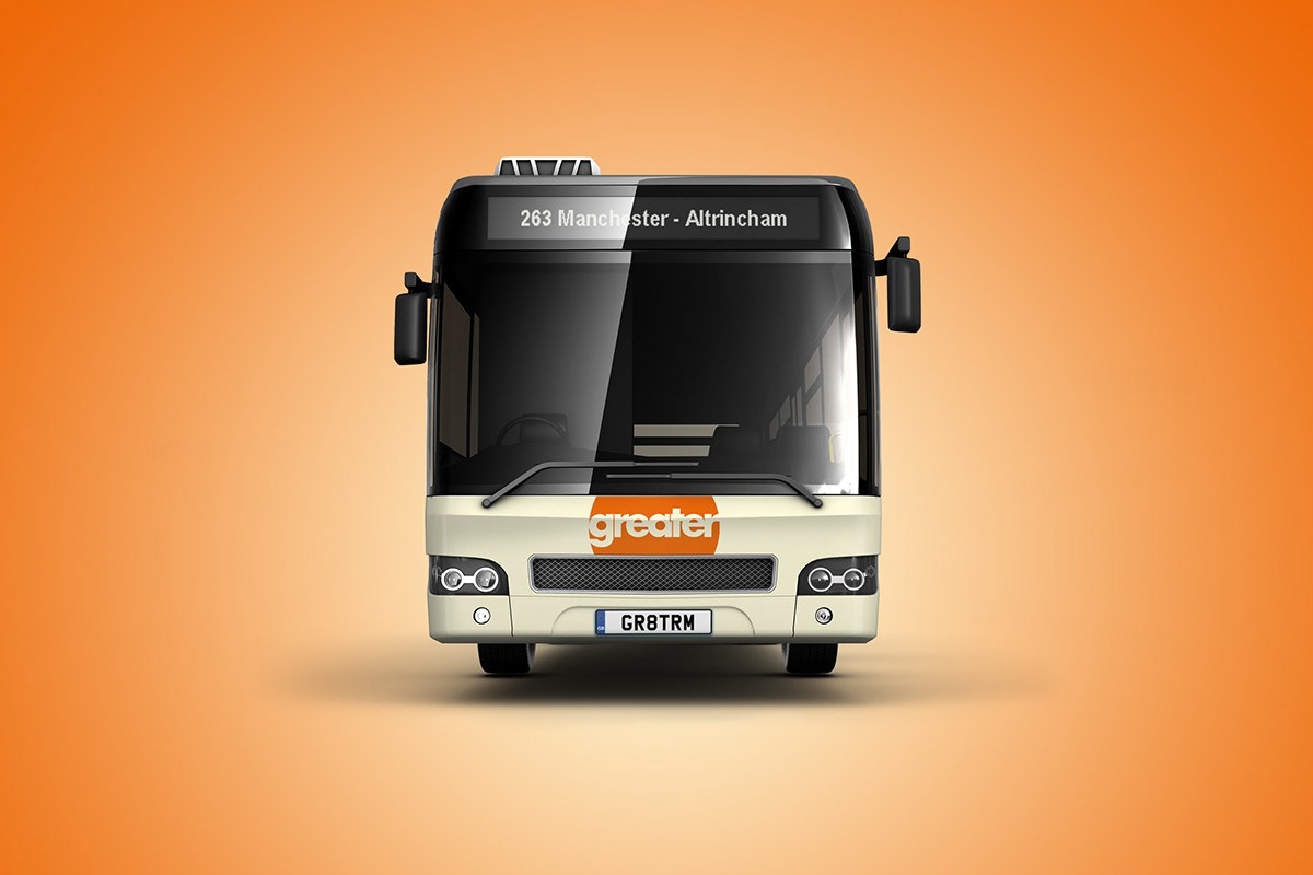
Maintaining a link to the original liveries, the orange and off-white colour palette are retained along with the simple lines, leaving the circle logo as the livery’s key identifiable feature. To keep contra-vision to a minimum while also maximising impact, we use the logo across the entire rear of the vehicle but only in a thin outline on the glass.
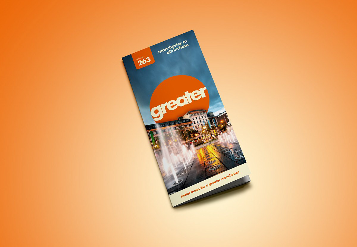
For the timetable covers, we were keen to make good use of a prime location shot from the area. So the logo sits majestically behind iconic buildings of Manchester, giving a feeling of pride and confidence in the city.
We set out to try something different with this livery, but as ever, not stray too far from the brand’s original heritage. A revival of the orange and cream awaits…
To see all of our other rebranding projects, visit www.mhdpartnership.co.uk
There has been no word of what livery they might wear, but we've created something appropriate for the new regime...
We had little hesitation in making the buses orange again, but with a shorter name. Greater Manchester Transport has become a simpler, punchier and more memorable “greater”. This simple adaptation works well with the double meaning of representing both the geography of Greater Manchester alongside the implications of a better bus service. The strapline “better buses for a greater Manchester” rolled off the tongue straight after.
The identity itself is made up of a lowercase Futura font, giving a contemporary feel to what is already an established brand. Futura is a nicely rounded, almost friendly sans serif font that looks welcoming even when used on such a large scale. Each letter in the logo has been hand-spaced and overlapped where possible to ensure a simple, clean appearance. The logo is then contained within a circle device, signifying the Greater Manchester area that the brand covers.
Maintaining a link to the original liveries, the orange and off-white colour palette are retained along with the simple lines, leaving the circle logo as the livery’s key identifiable feature. To keep contra-vision to a minimum while also maximising impact, we use the logo across the entire rear of the vehicle but only in a thin outline on the glass.
For the timetable covers, we were keen to make good use of a prime location shot from the area. So the logo sits majestically behind iconic buildings of Manchester, giving a feeling of pride and confidence in the city.
We set out to try something different with this livery, but as ever, not stray too far from the brand’s original heritage. A revival of the orange and cream awaits…
To see all of our other rebranding projects, visit www.mhdpartnership.co.uk