

When approaching the rebranding of any former bus company, we start with a bit of research into its history. One particular thing grabbed our attention about Devon General. Back in 1984, they ran an innovative high-frequency service starting with 22 minibuses. Within two years the minibus fleet had expanded to more than 200 vehicles. We like experimental! This got us thinking; how could we go a step further and make this relevant and usable today?
In summer 2016 a premium, shared ride-to-work service called Slide launched in Bristol. It's a cross between a bus and a taxi, and we like the idea. Buses run services all day every day, regardless of how many people are onboard, that’s wasteful. So we decided the focus of this rebrand would be smarter bus travel.
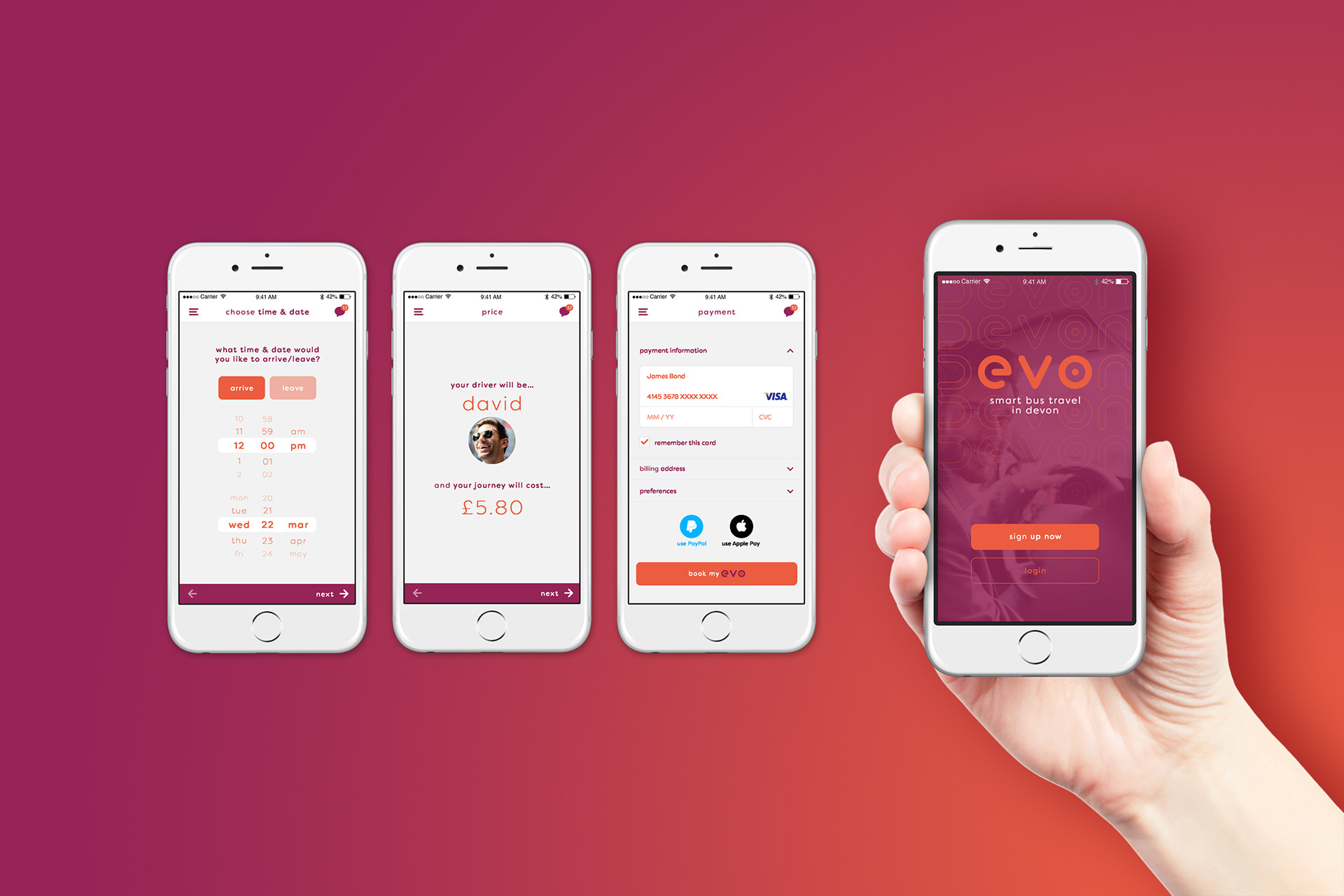
The premise of this smart travel is the bus goes where there is demand. There would be an app to book and pay for your journey. You would be given a pick-up and drop-off point, within a five-minute walk from your home and destination. You would then travel with other people who have booked similar journeys, therefore making your travel more direct than the average bus journey. This sort of service would be targeted specifically during work commuter hours when most rides are taken.
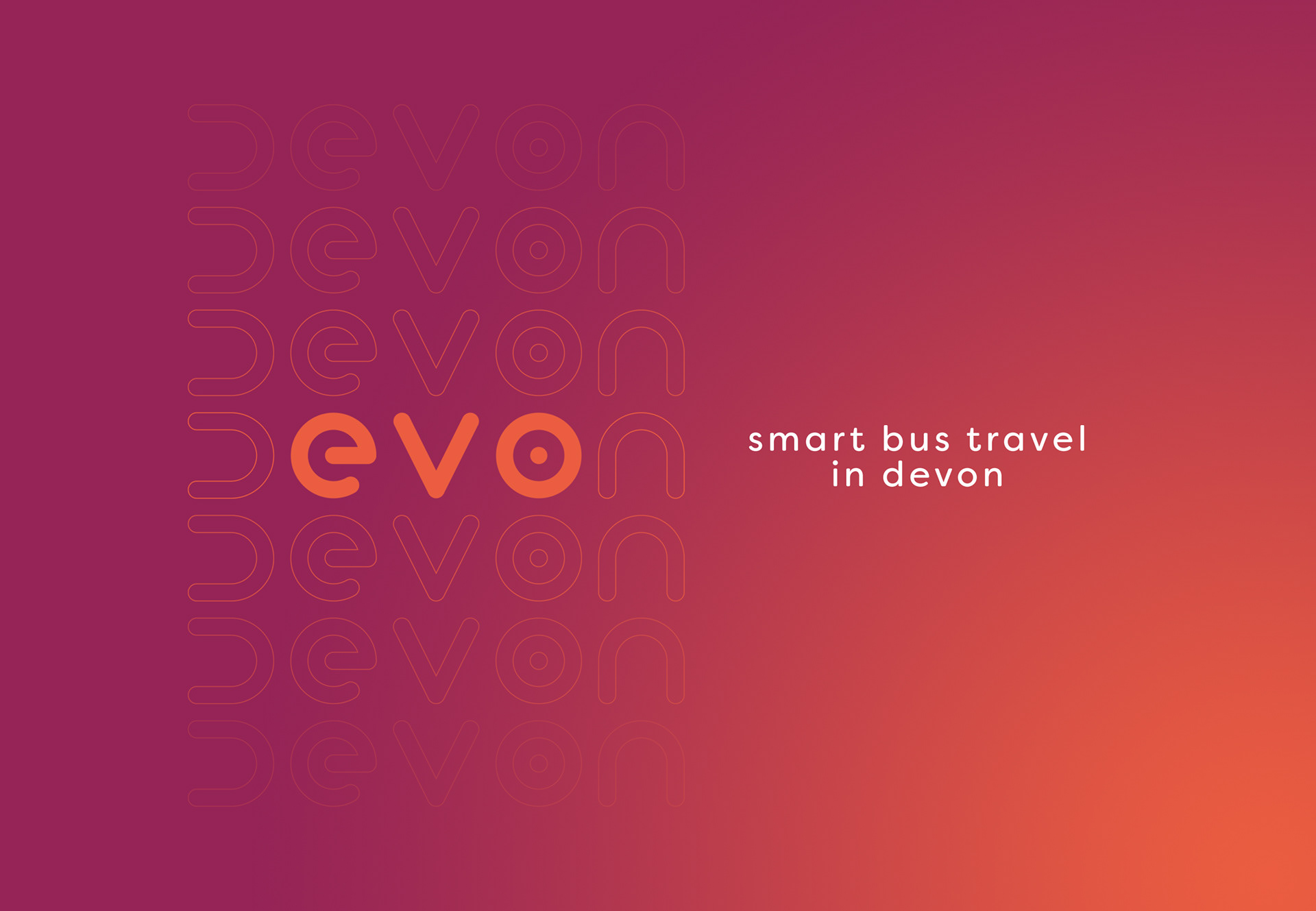
We decided a radical overhaul like this would need an entirely new name. We started thinking of words related to the efficiency of an on-demand service. That progressed to the evolution of the service. Then the lightbulb moment came! EVO in D-EVO-N! Perfect. It represents how we want this service to show its moved on from the bus, to be more user-friendly and economical plus it’s literally IN Devon.
The logo came together beautifully. Firstly because the letters in evo have such a lovely balance to them. The characters have been designed using a circle as a base to retain a standard or curve. Taking advantage of artistic licence on the 'd', using the simplified 'n' and rotating it and hey presto! The addition of the dot in the 'o' makes for a signature graphic that could be used in the app and across various materials.
The colour scheme is also an evolution of the traditional red and cream of old. We’re using colours that are not typically synonymous with bus travel, a small rebellion on our part - but that marks a change.
Anyway, we’re not designing a livery for a bus; it’s an eight seater people carrier, with a two tone of pink and orange will surely guarantee it wouldn’t be missed. Could this type of travel be considered seriously by bus companies? Makes sense to us.