
Eastern National is a great example of traditional bus branding, and this base gave us the ideal opportunity to bring it up-to-date. Starting with a clean slate, the branding was stripped back to its bare bones leaving just the name 'Eastern' as our sole reference to those bygone times.
With diesel buses having a reputation as polluters, replacing them with their electric counterparts was the natural progression for a 21st-century transport operator. Separating the E and the ‘stern’ doesn’t change your pronunciation of the company name but lets us suggest the double meaning of the E - for both east and electric. All enforced by making the E into a standalone icon device that would become the crest of the brand.
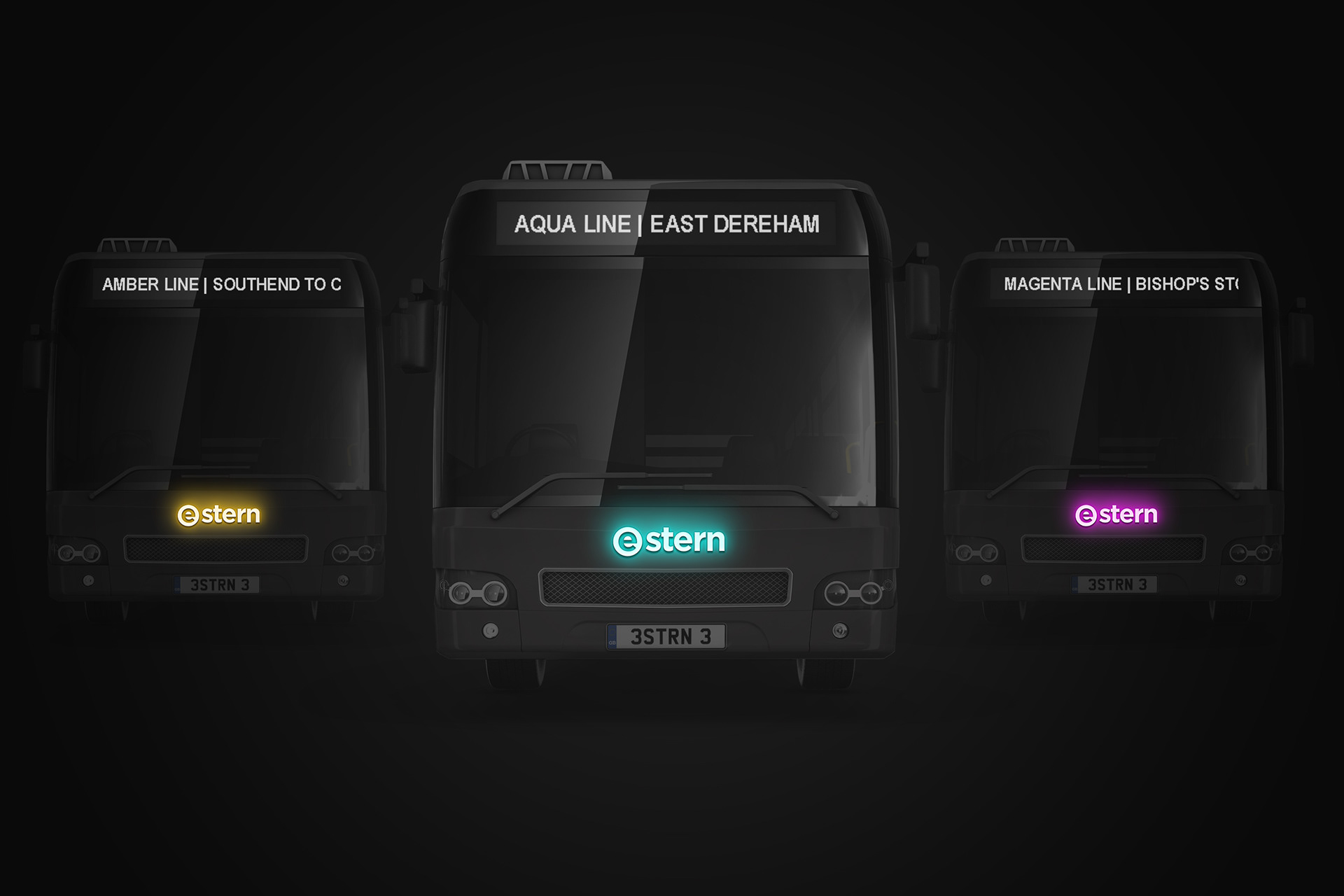
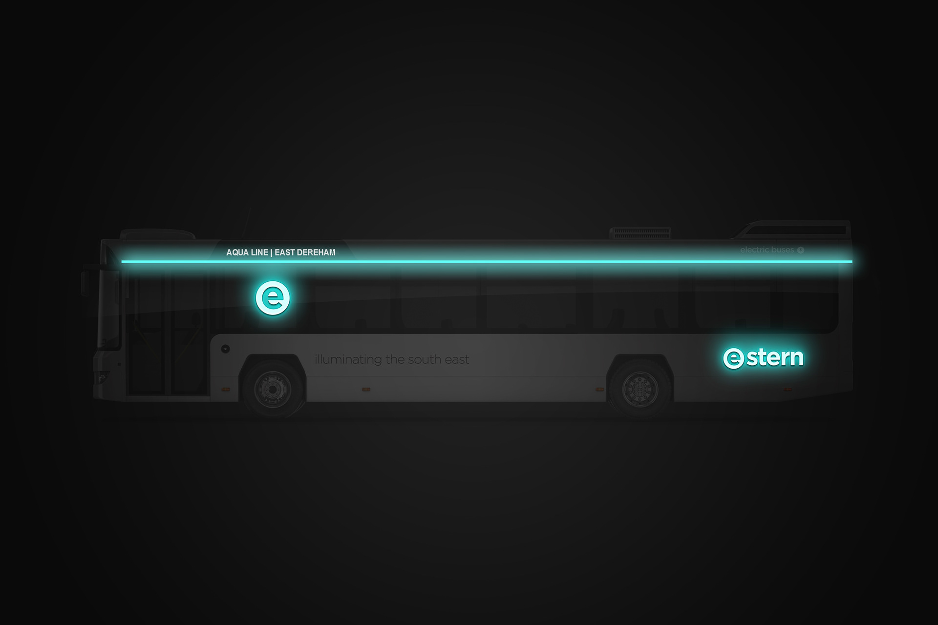
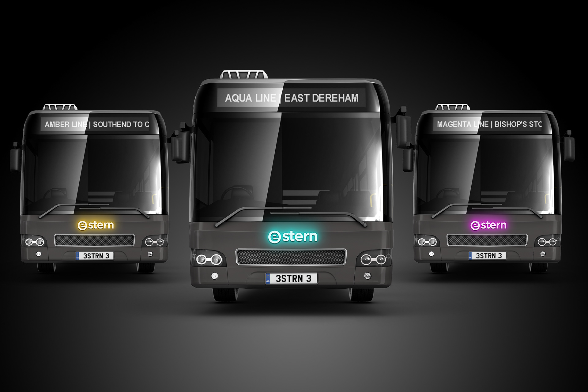
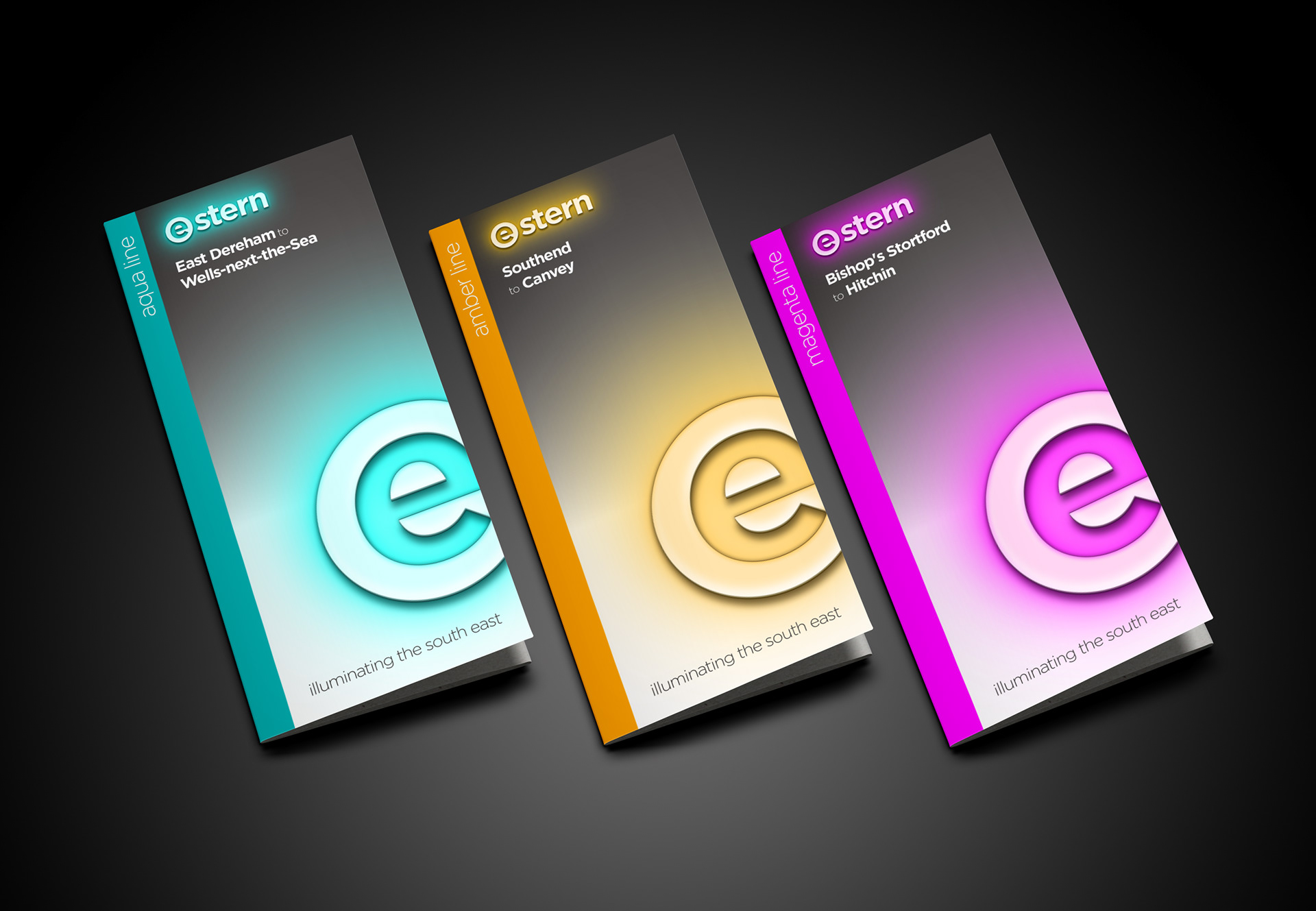
For this concept, we wanted to try something that we have never seen before - using external LED lighting to colour-code routes, in this case, the Aqua line. This simple (and hopefully one day practical) approach to route branding has a dynamic effect while at the same time enhancing the modern, electric and environmental promise of the brand. The icon and logo on the livery are back-lit and paired with a light bar that runs the length of the bus - a strip that could have a pulse travelling from front to back when stopped, adding extra presence to the livery.
To get over any logistic problems of route branding vehicles, all buses in the fleet would be in standard grey and white livery, but at the flick of a switch, the route branding could be changed accordingly using the LED lighting. No worries with spares on this fleet!
Our strapline; ‘illuminating the south east’ perfectly sums up what this rebranding project has delivered for the 21st-century bus user.