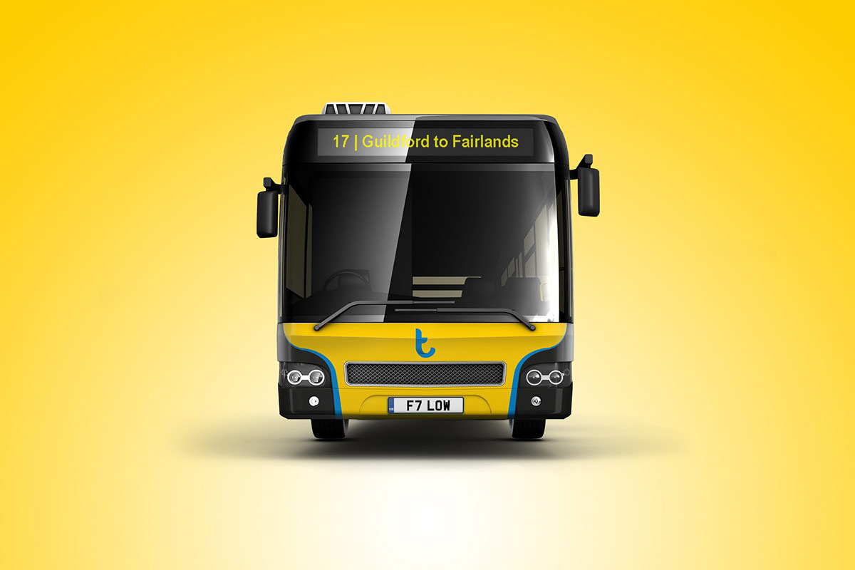
When imagining a new identity and livery design for Tillingbourne, we started where its founders began 92 years ago.
Tillingbourne is a bus company that owes its name to the local river — The Tilling Bourne — so it seemed fitting to take inspiration from the waterways. Unfortunately, when it came to the name itself, it came across as an awkward mouthful – and definitely something that users were unlikely to say in full.
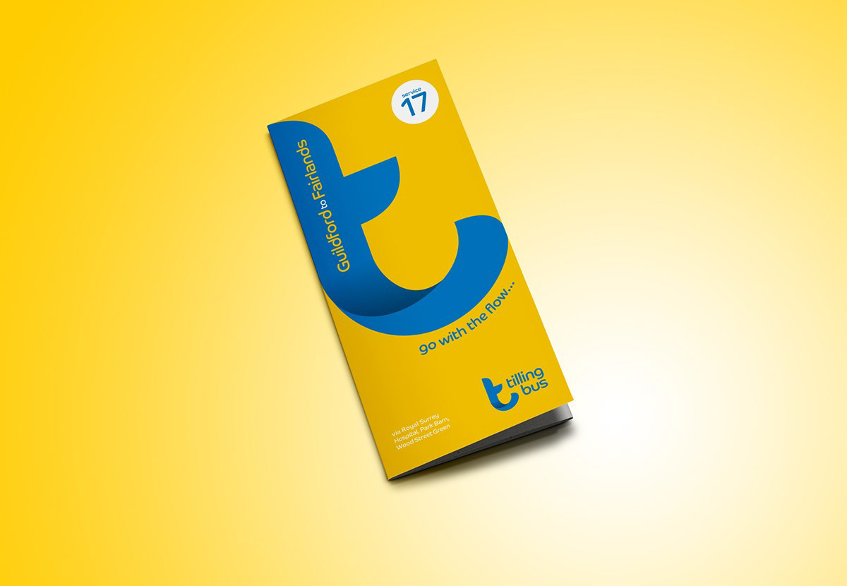
Abbreviating to just TBC was something we considered initially (and subsequently rejected for being too corporate), so shortening it to a more user-friendly ‘tilling bus’ was decided on to help the project move on.
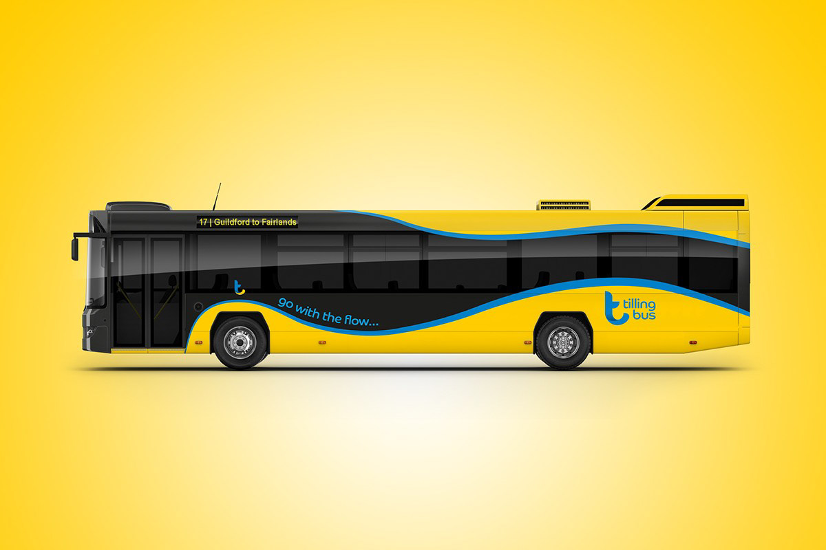
The identity itself comes in the form of a strong lower case ‘t’ shape — a graphic that has been crafted to flow like the river by which it is influenced. The chosen typeface has a nice balance of softened edges to complement the livery but not so much so that it looks too comical or would lose legibility when scaled. The identity can be used on its own as an icon in advertising and also with the descriptive ‘tilling bus’ wording in more design- or corporate-led communication. It also incorporates a very subtle arc of darker blue shading to add a little depth to the logo mark.
This relatively simple livery execution is an evolvement of the existing application, primarily seen through keeping the original recognisable colour palette of blue and yellow.
The yellow really pops out against the darker background, while the organic lines transform the bus from its usual angular shape to something more welcoming. The windows and door areas have been used to create the flowing ‘river’ shape that runs through the vehicle’s body.
The livery also ties in nicely with the new ‘go with the flow…’ strapline, supporting the waterways theme and further helps to build an identity for a bus that he believes promises to deliver a smooth and relaxed journey.